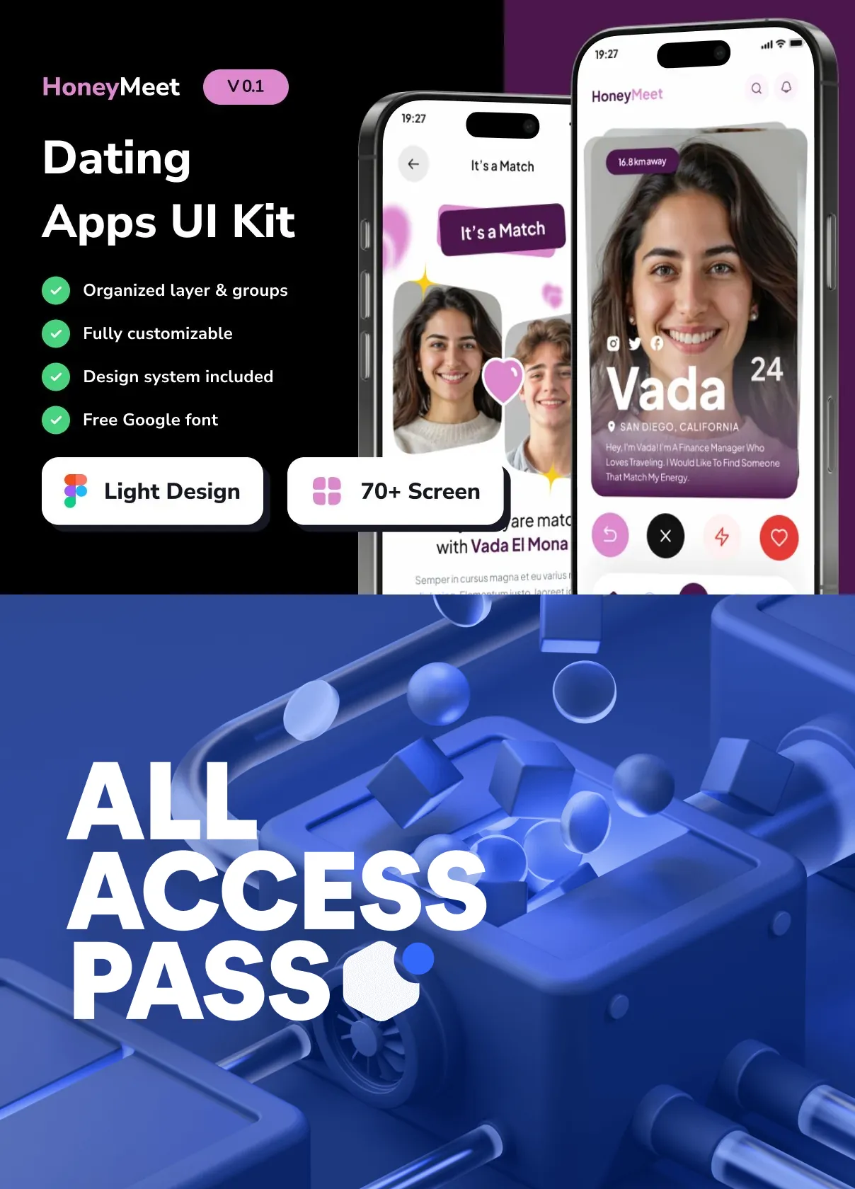
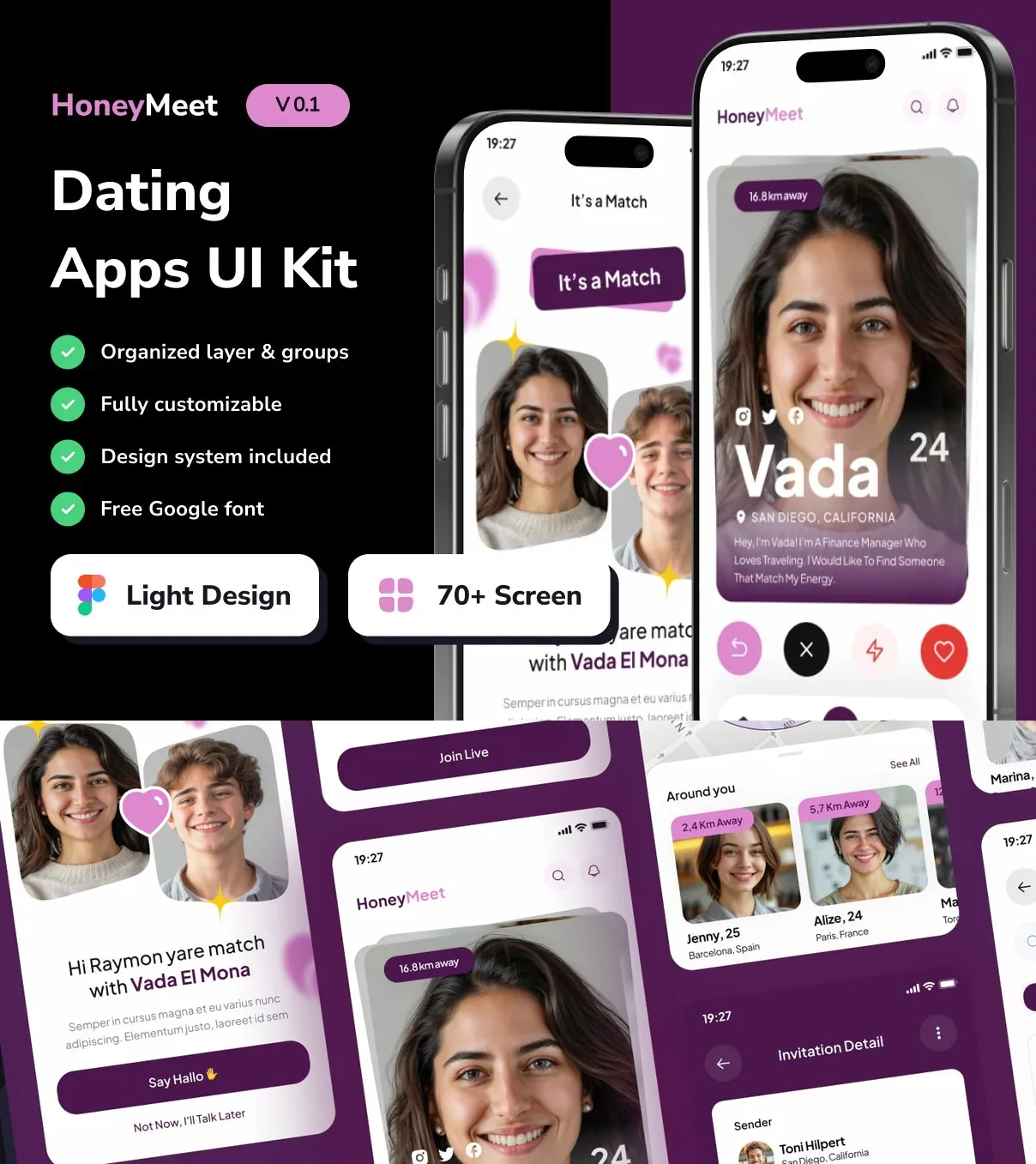
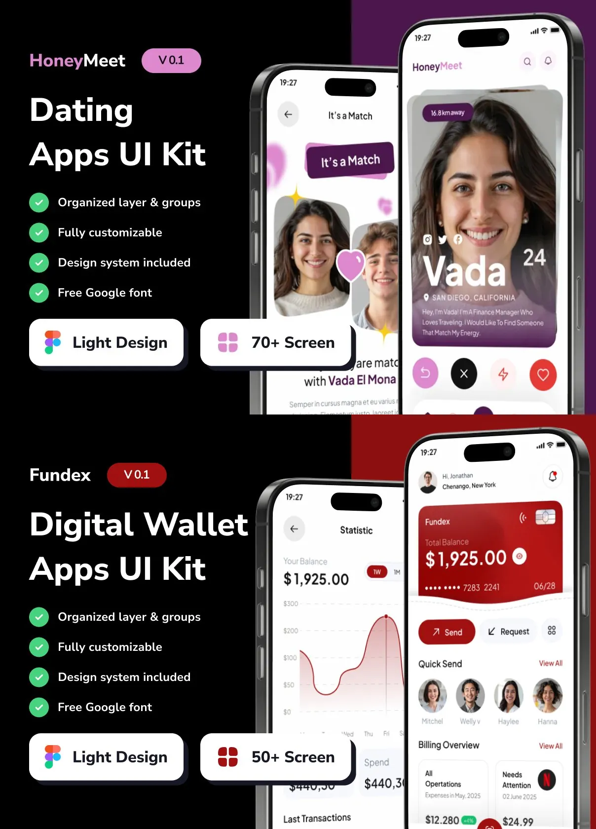
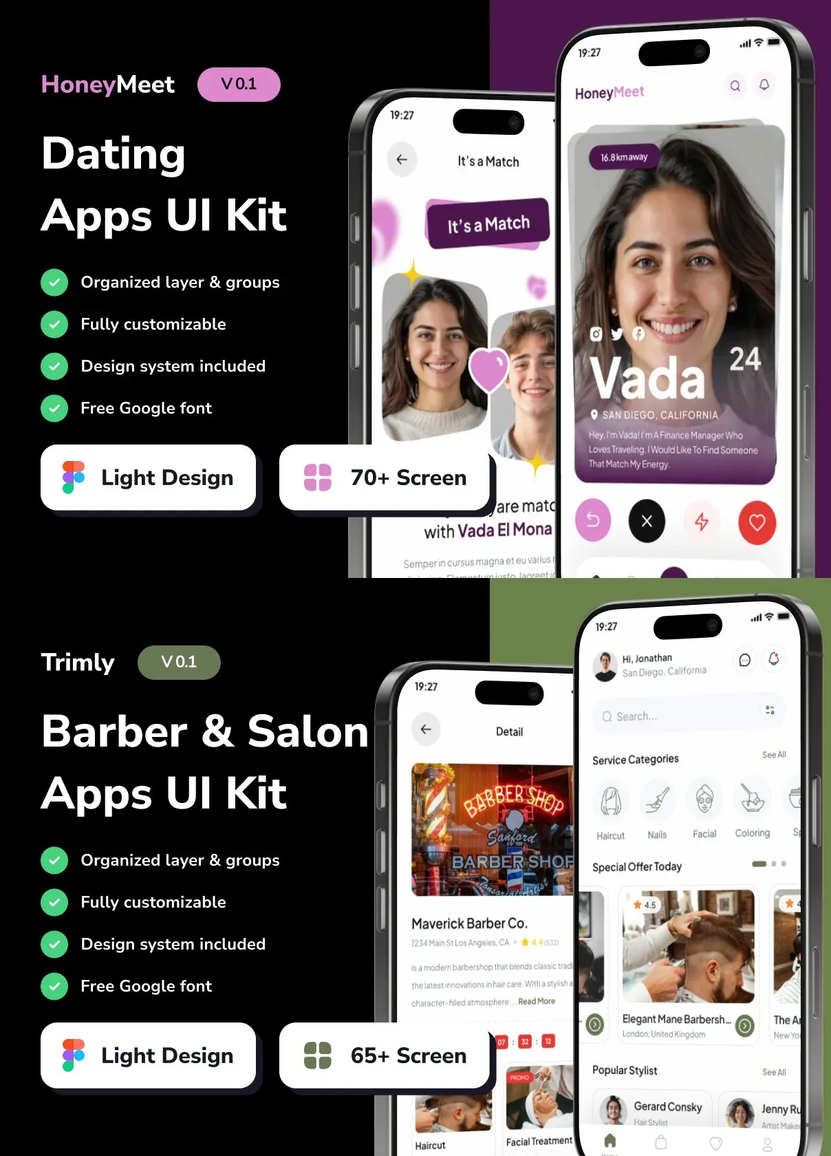
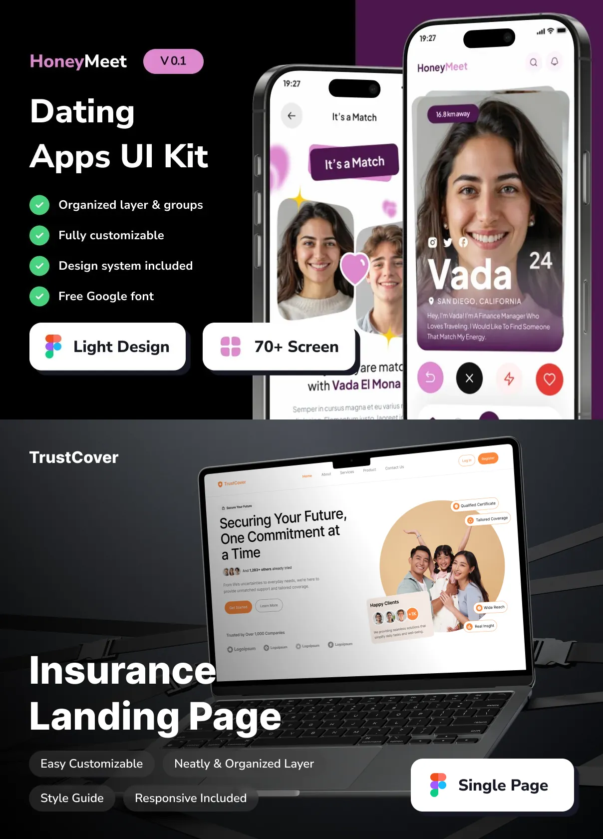
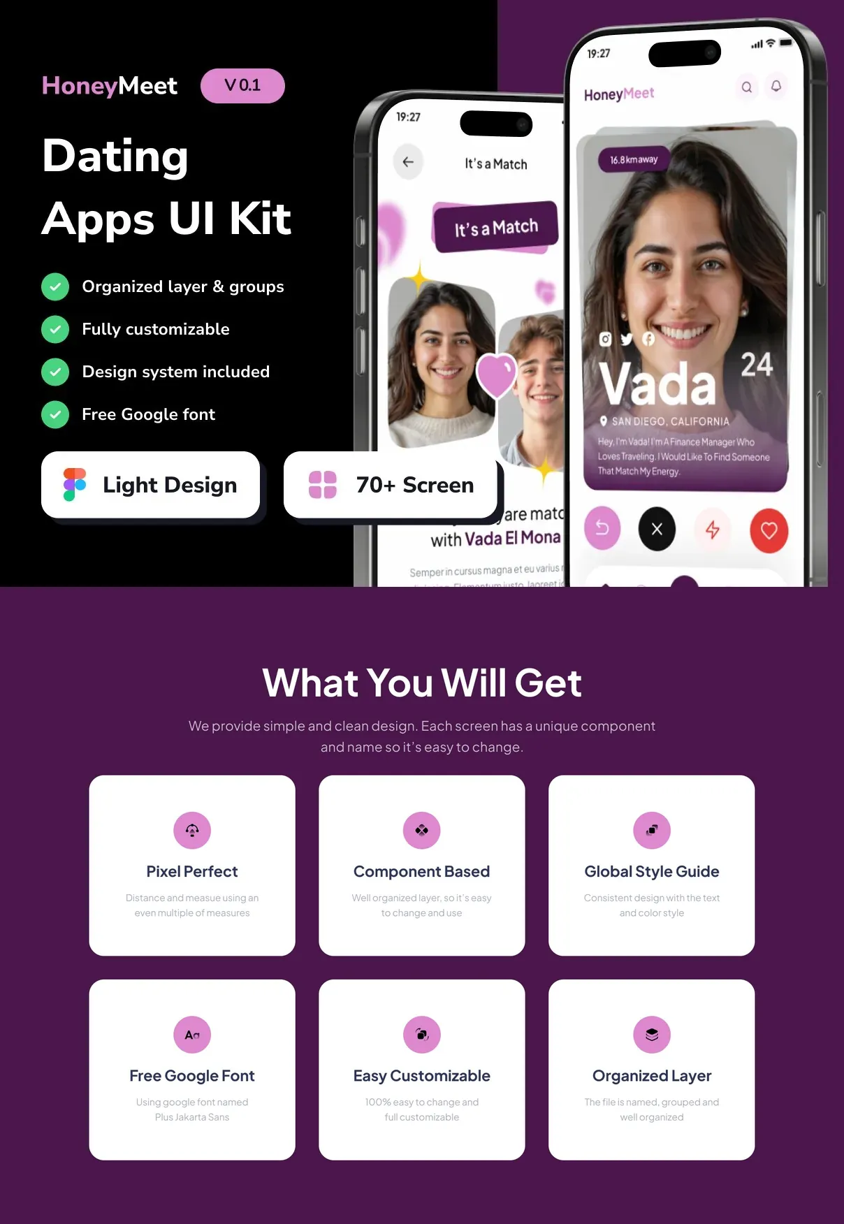
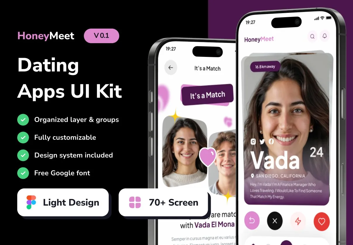
HoneyMeet delivers a powerful, ready‑to‑use design system for creating modern, engaging dating apps. Built for designers and product teams, this UI kit provides everything needed to launch a feature‑rich, visually stunning matchmaking experience that attracts users and fosters meaningful connections.
Why Choose HoneyMeet for Your Dating App?
In a crowded market, a polished interface can be the deciding factor for user retention. HoneyMeet equips you with:
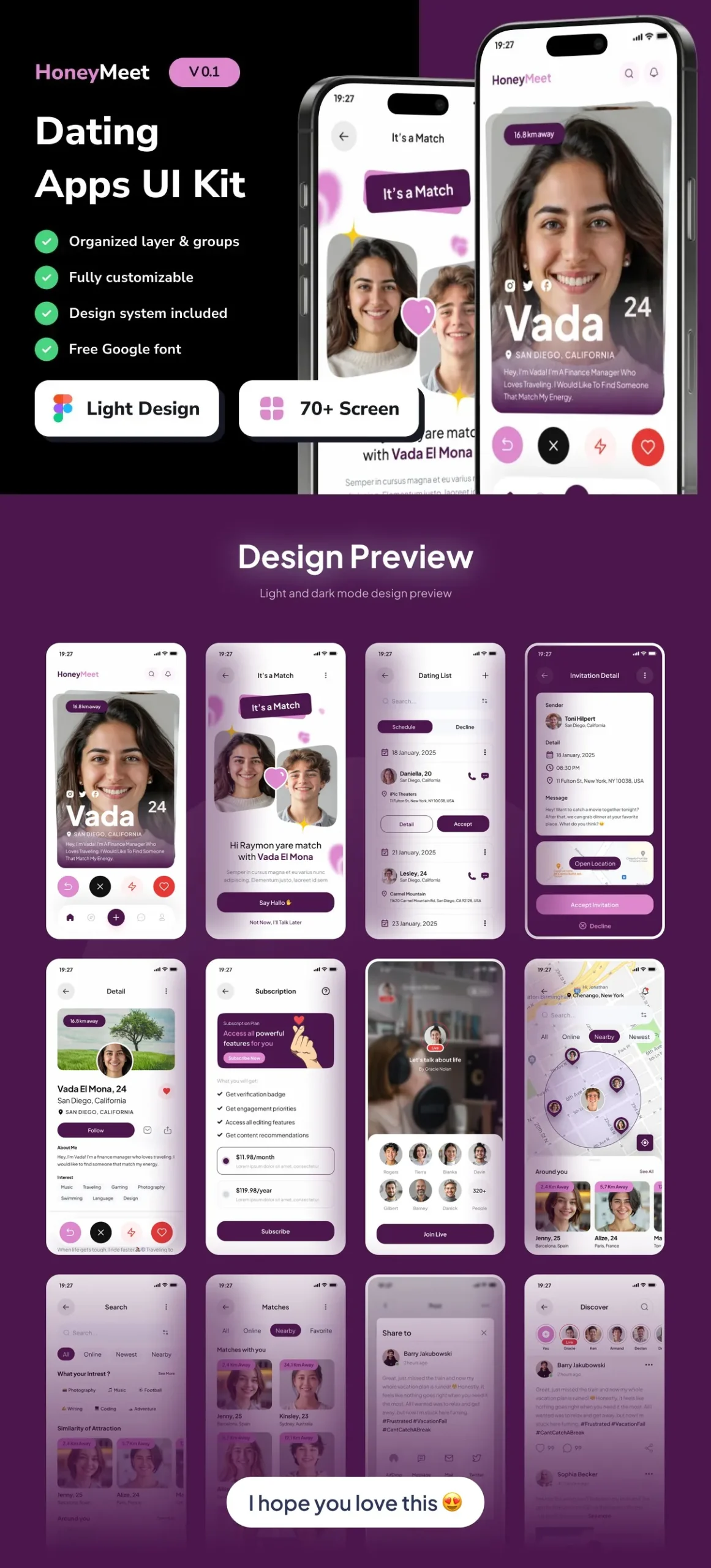
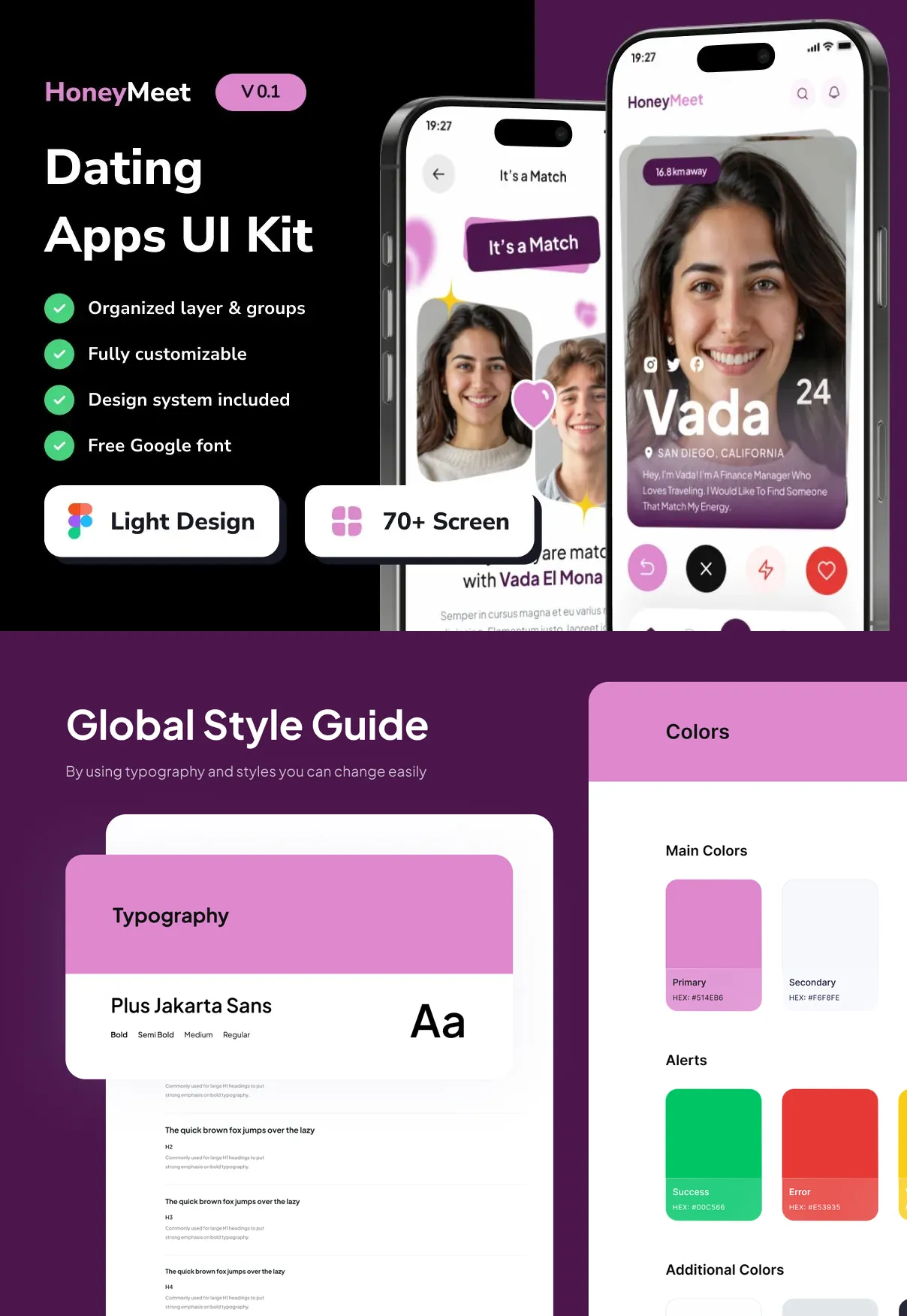
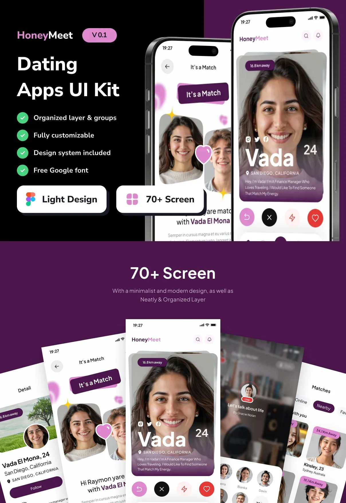
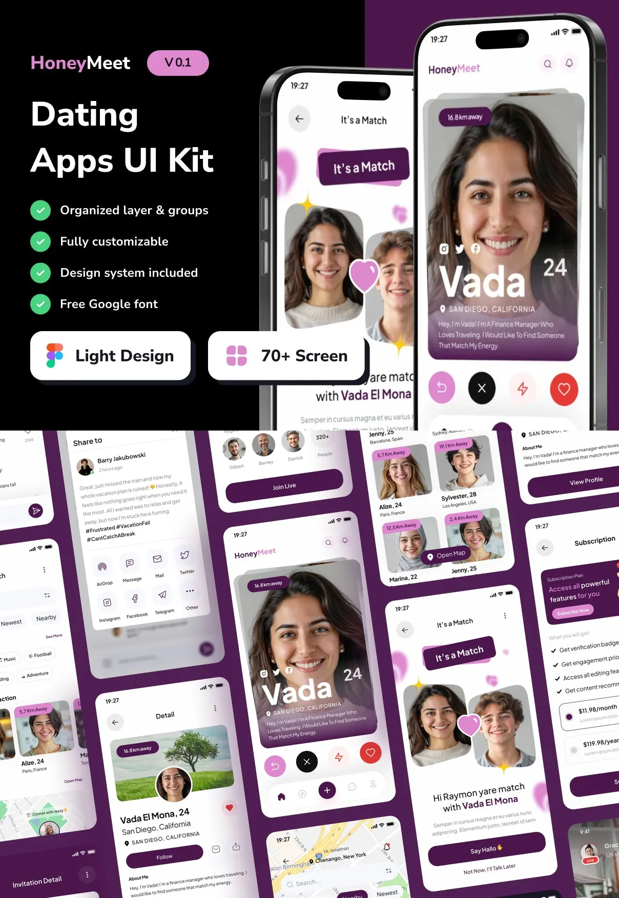
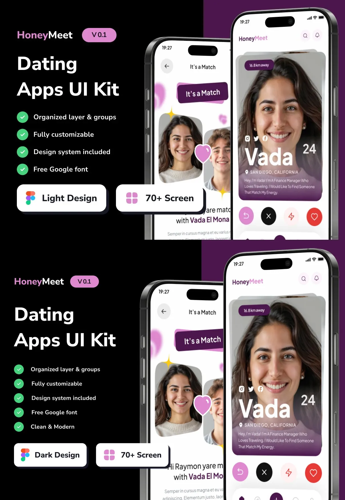
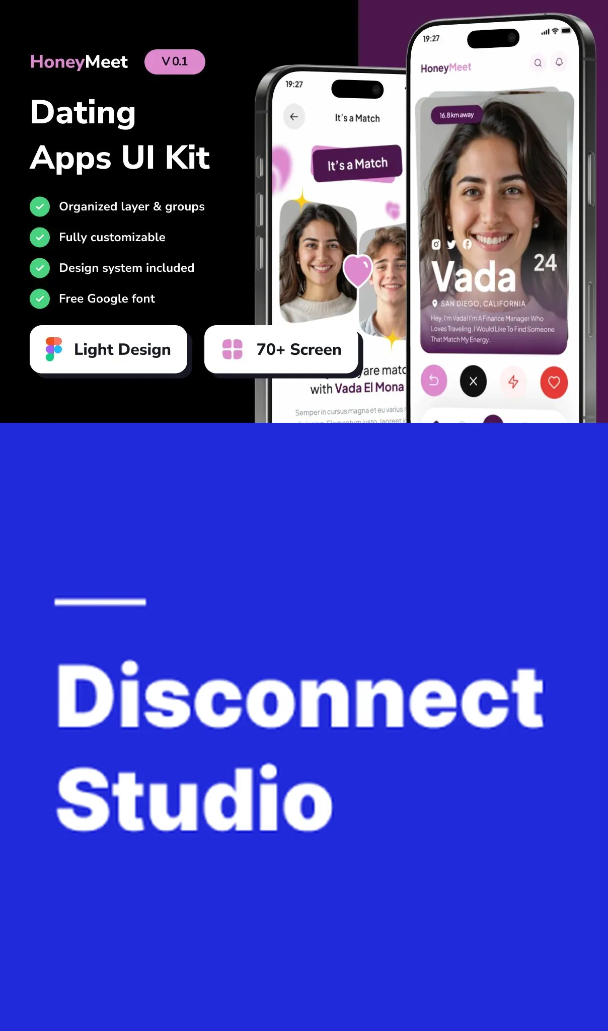
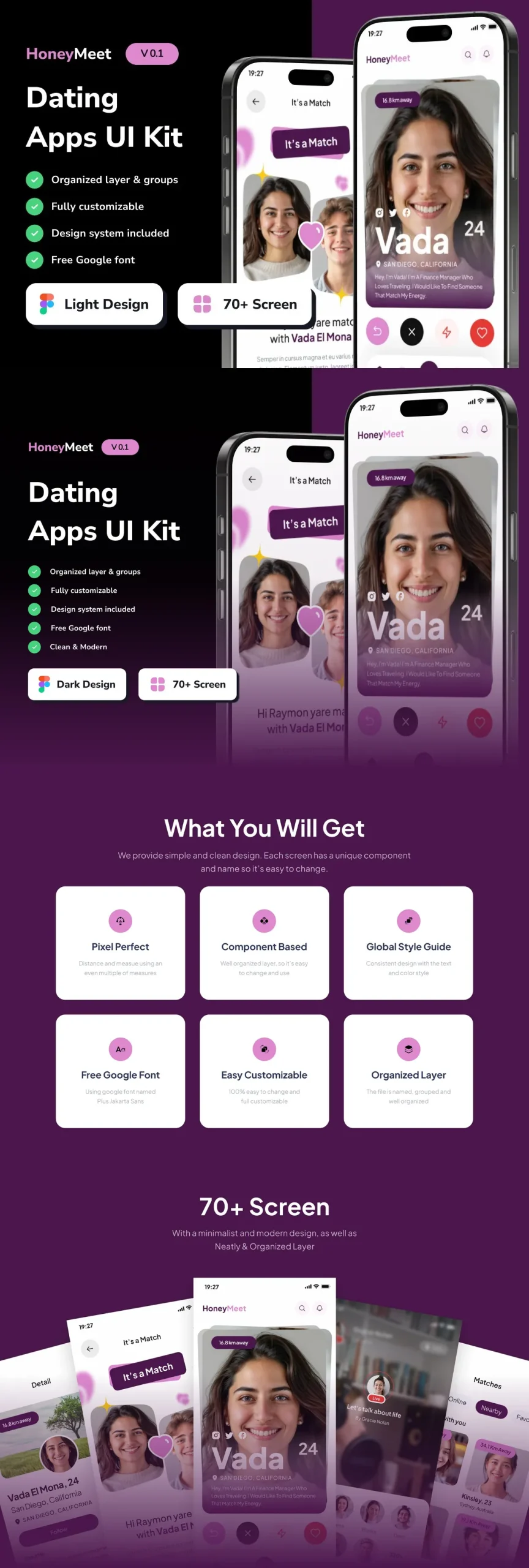
- 80+ high‑resolution screens covering every stage of the dating journey—from onboarding to chat, profiles, and premium features.
- Auto‑Layout powered components that adapt instantly to different device sizes, ensuring a consistent experience on smartphones and tablets.
- Dual dark and light themes to match brand identity and improve accessibility for users in any lighting condition.
- Comprehensive style guide with color palettes, typography scales, iconography, and UI tokens, guaranteeing visual coherence across the entire product.
- Fully editable layers allowing quick customization of colors, fonts, imagery, and copy without breaking the design system.
Key Features at a Glance
Screen Library
The kit includes meticulously designed screens for:
- Welcome & onboarding flows
- Profile creation and editing
- Match discovery (swipe, grid, list)
- Chat and messaging interfaces
- Search and filter controls
- Premium subscription pages
- Push notification templates
- Settings, privacy, and account management
Component System
All UI elements are built with Figma Auto‑Layout (and compatible with Sketch), enabling designers to:
- Resize components while maintaining spacing and alignment
- Swap content blocks without manual adjustments
- Apply global changes via shared styles and variables
Design Tokens & Export Options
HoneyMeet provides ready‑to‑use design tokens for colors, typography, and shadows, plus exportable assets in SVG, PNG, and PDF formats. Developers can also pull CSS snippets, SwiftUI code samples, and JSON style definitions directly from the kit, shortening hand‑off time.
Design Philosophy
HoneyMeet adopts a **clean, romance‑focused aesthetic** that balances vibrant accent colors with ample white space, highlighting user photos and key interaction points. High‑contrast typography guides attention to calls‑to‑action such as “Match Now” or “Upgrade to Premium,” encouraging conversion.
Interactive states—including hover, active, and disabled—are pre‑designed, giving a polished feel without additional prototyping effort. The UI also incorporates subtle micro‑animations (e.g., swipe gestures, heartbeat icons) that enhance user delight while remaining lightweight for mobile performance.
User Journey Mapping
Every screen follows a logical flow that mirrors real‑world dating behaviors:
- Discovery: Users swipe through potential matches, filter by interests, and view detailed profiles.
- Connection: A single tap opens a chat window with rich media support (photos, emojis, voice notes).
- Engagement: Gamified features like “Super Like” and “Boost” drive interaction, while premium upgrades unlock advanced matching algorithms.
- Retention: In‑app events, push notifications, and personalized suggestions keep users returning daily.
Collaboration & Handoff
HoneyMeet’s file structure uses clear page naming and component grouping, making collaboration across design, product, and engineering teams seamless. The kit includes a developer handoff guide with instructions for exporting assets, mapping tokens to code, and integrating with popular frameworks such as React Native and Flutter.
Support, Updates, and Licensing
Purchasing HoneyMeet grants you lifetime access to updates. Future releases will add new device resolutions, expanded micro‑interaction libraries, and AI‑driven recommendation widgets. Dedicated email support ensures any customization questions are answered promptly, and a private community forum provides peer‑to‑peer tips and inspiration.
Ideal Users
- Startup founders seeking a polished, market‑ready UI without the overhead of building from scratch.
- Design agencies that need a reusable foundation for multiple dating‑app projects, accelerating delivery timelines.
- Product managers looking to prototype and test new matchmaking features quickly.
Getting Started
Download the kit, open the Figma (or Sketch) file, and explore the layered page hierarchy. Duplicate any screen, adjust colors, fonts, and imagery to match your brand, then export the assets for development. Follow the built‑in style guide to maintain consistency, and you’ll be ready to launch a compelling dating experience that captures hearts and drives growth.