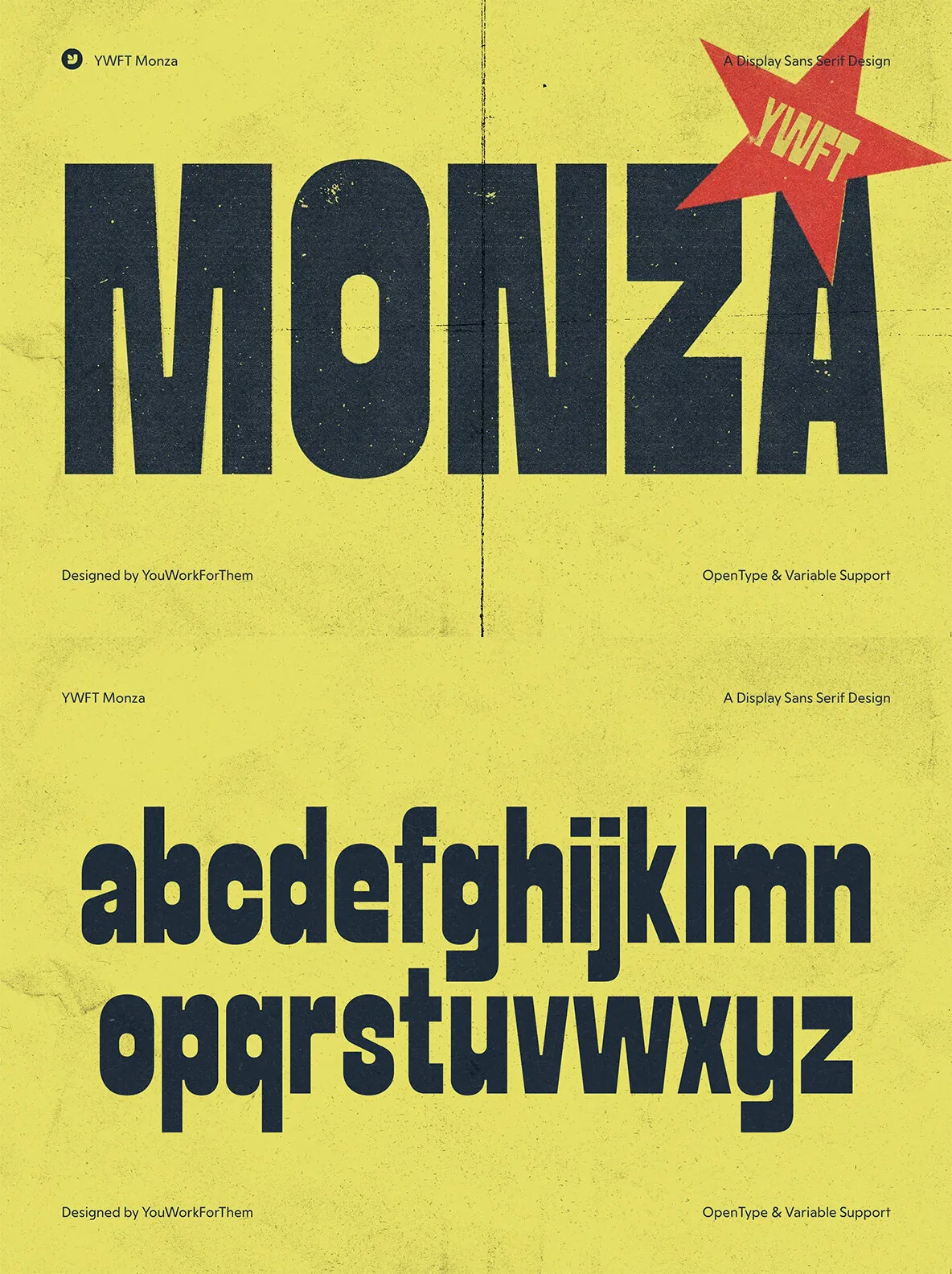
Monza: A Tall Display Sans Channeling Punk Poster Energy
Monza captures the uncompromising essence of late ’70s and early ’80s European punk and rock posters, offering a tall, condensed sans serif that asserts itself across any layout. Designed for clear, loud headlines, its vertical stance and blunt character let typography cut through the visual noise—making it ideal for posters, digital billboards, and editorial spreads where impact is crucial. The font’s geometry references its era—clean lines underlying a raw, kinetic surface, hinting at the transitional vibe between late disco and early punk aesthetics.
This typeface adapts seamlessly from gritty gig flyers to refined retro layouts, delivering a versatile typographic tool without relying on visual gimmicks. Monza fits a broad spectrum of uses, from merchandise and album designs to bold headlines on web platforms. For those who value purposeful display fonts, Monza sits confidently in its own lane: assertive, narrow, and ready to support complex typographic hierarchies.
Monza includes four distinct styles and a variable option. Each weight carries a robust set of over 400 glyphs, accommodating advanced typographic requirements such as alternates, symbols, and detailed headline refinement.
OpenType Features & More:
4 styles plus a variable option
Over 400 glyphs per weight
Standard ligatures
Stylistic alternates
Fractions
Glyph compositing and decomposition
Localized letterforms
Ordinals
Superscript
Additional products used for slideshow images:
HOM Poster 07 Mockup