Flex Design System is a powerful and adaptable Figma design system meticulously crafted from real-world experience to accelerate your design workflow without compromising quality. Built specifically for UX/UI professionals, this system offers a comprehensive suite of fully tokenized, responsive components, templates, and detailed documentation that empower you to deliver consistent, scalable, and polished designs faster than ever before.
Extensive Features to Enhance Design Quality and Efficiency
Flex Design System is packed with professional-grade features that streamline your design process and elevate the quality of your work. It includes:
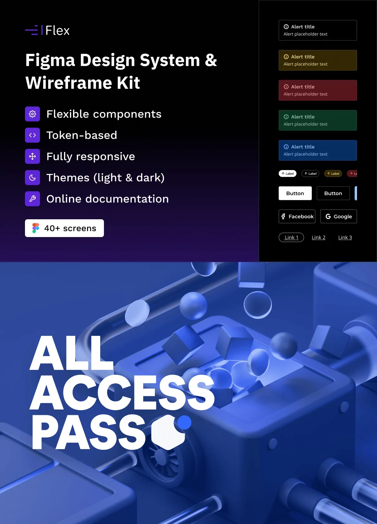
- 196 Design Variables: A vast array of meticulously named and organized design tokens that control colors, typography, spacing, and more, enabling effortless global updates and maintaining design consistency.
- Two Themes (Light & Dark): Seamlessly switch between light and dark modes to accommodate diverse user preferences and project requirements, ensuring your designs are versatile and accessible.
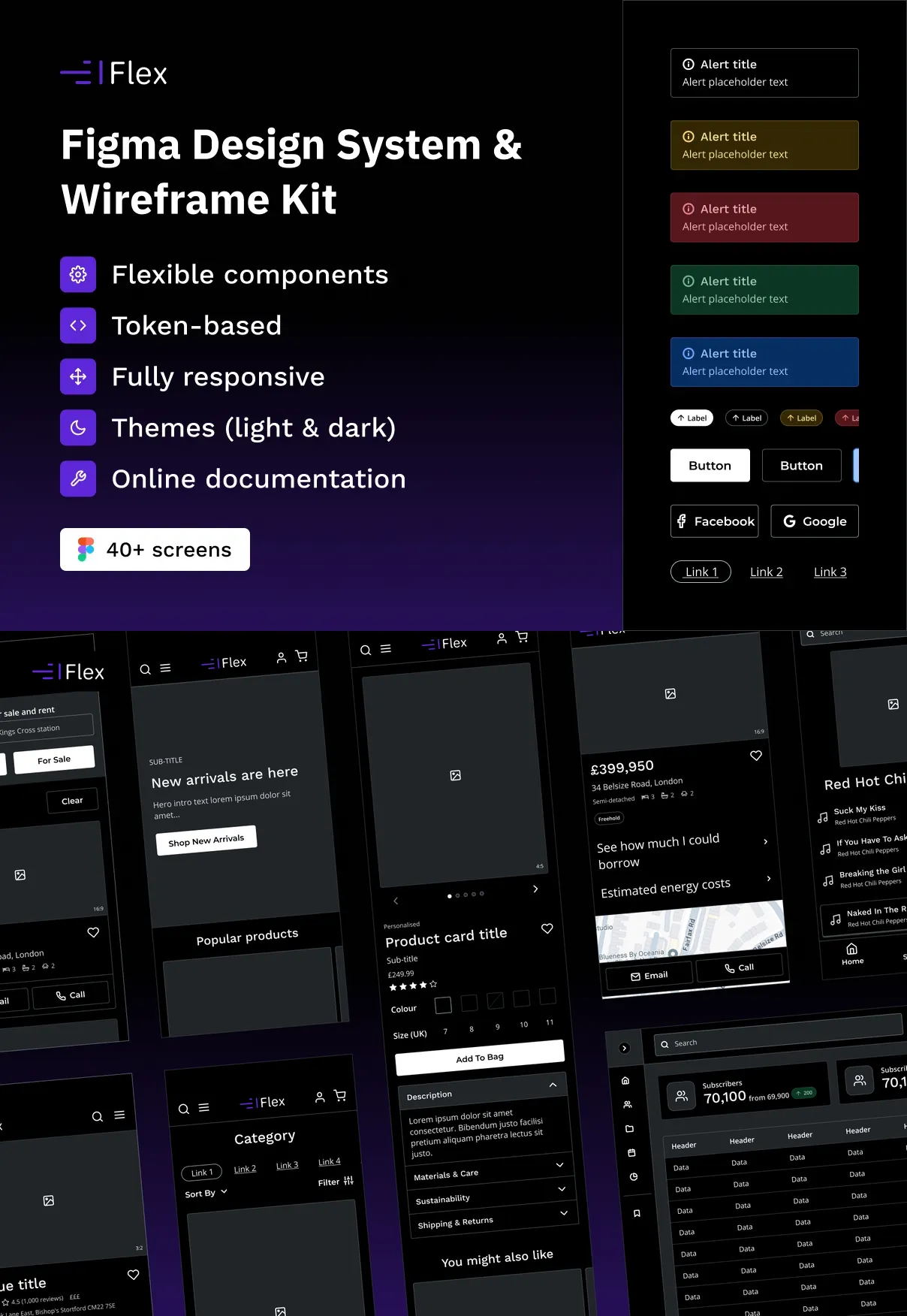
- Three Breakpoints: Responsive layouts optimized for multiple screen sizes, allowing your designs to adapt fluidly across desktop, tablet, and mobile devices.
- Responsive Typography: Dynamic text styles that adjust intelligently to different screen sizes, enhancing readability and visual hierarchy.
- 32 Component Types: A comprehensive collection of UI components covering a wide range of interface needs, from buttons and forms to navigation and data display elements.
- Over 500 Variants: Extensive component variants and overrides provide unparalleled flexibility, enabling you to customize and adapt components to fit any design scenario.
- Fully Customizable: Every element is designed for easy modification, allowing you to tailor the system precisely to your brand guidelines and project goals.
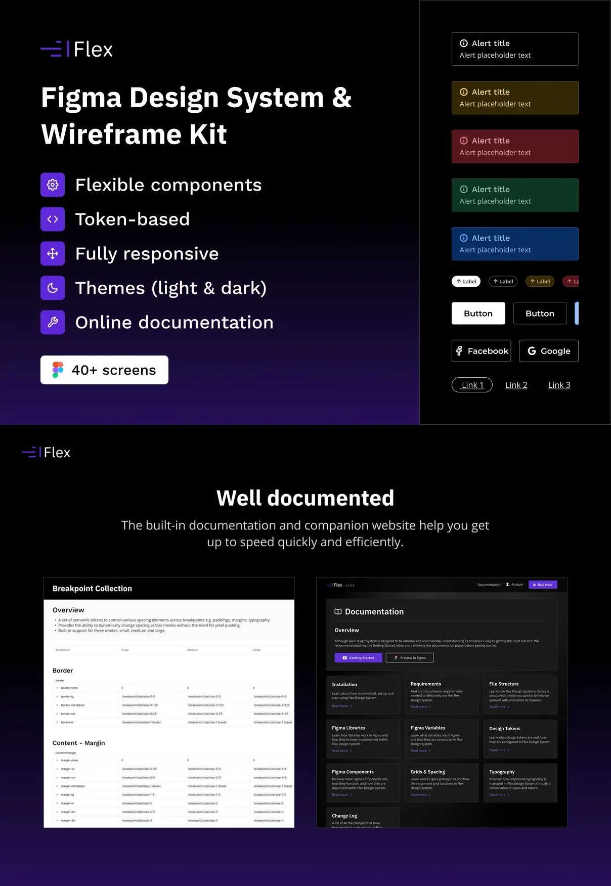
- Online Documentation: Detailed, accessible documentation guides you through the system’s features and best practices, ensuring smooth onboarding and efficient use.
A Vast Collection of Intuitive and Responsive Components
Flex Design System offers a rich library of intuitively designed components that are fully responsive and built to scale. Each component is crafted with attention to detail and usability, featuring extensive variants and overrides that allow you to adapt them effortlessly to your project’s unique needs. This flexibility reduces repetitive work and accelerates the design-to-development handoff.
Meticulously Organized Design Tokens for Streamlined Workflow
The design tokens within Flex are carefully named and structured to enhance your workflow. By centralizing control over fundamental design properties, you can implement global changes quickly and maintain visual harmony across your entire project. This organization not only saves time but also minimizes errors and inconsistencies.
Why Choose Flex Design System for Your UX/UI Projects?
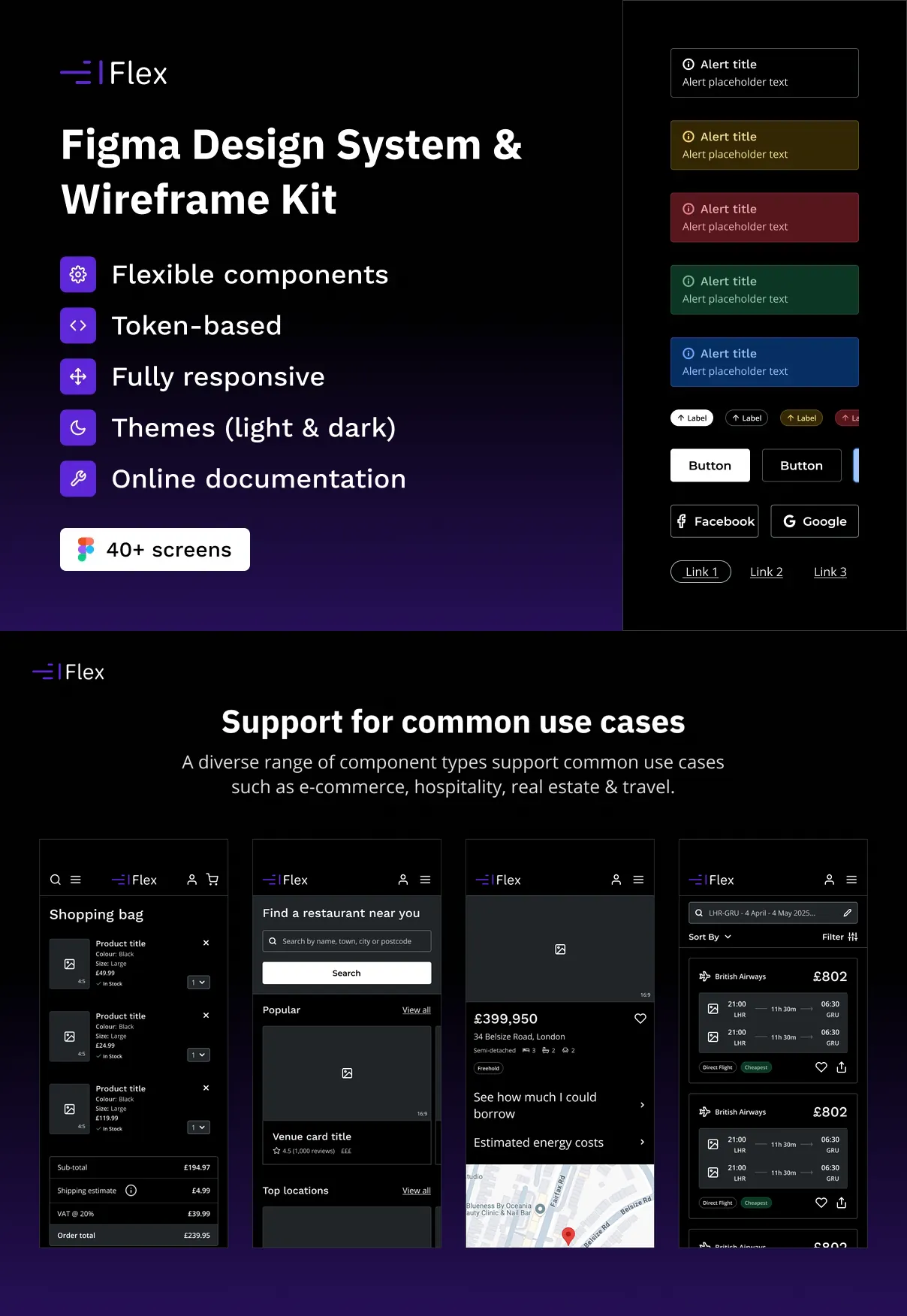
Flex Design System stands out as a comprehensive and scalable solution for UX/UI professionals who demand speed, quality, and consistency. Its robust feature set, combined with responsive design principles and extensive customization options, makes it ideal for a wide range of projects—from startups to enterprise applications. By integrating Flex into your workflow, you empower your team to deliver polished, user-centric designs efficiently and confidently.