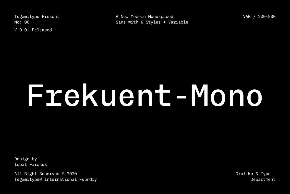

TG Frekuent Mono: Precise mono, quietly quirky
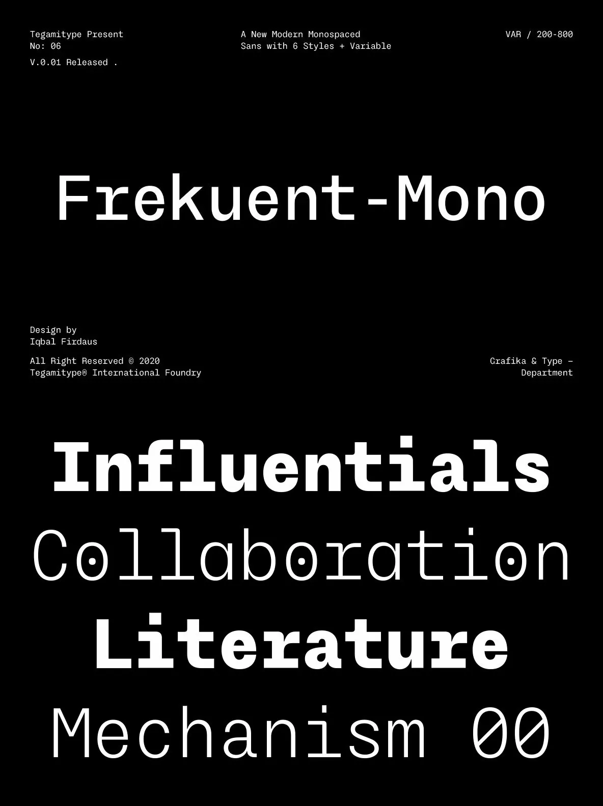
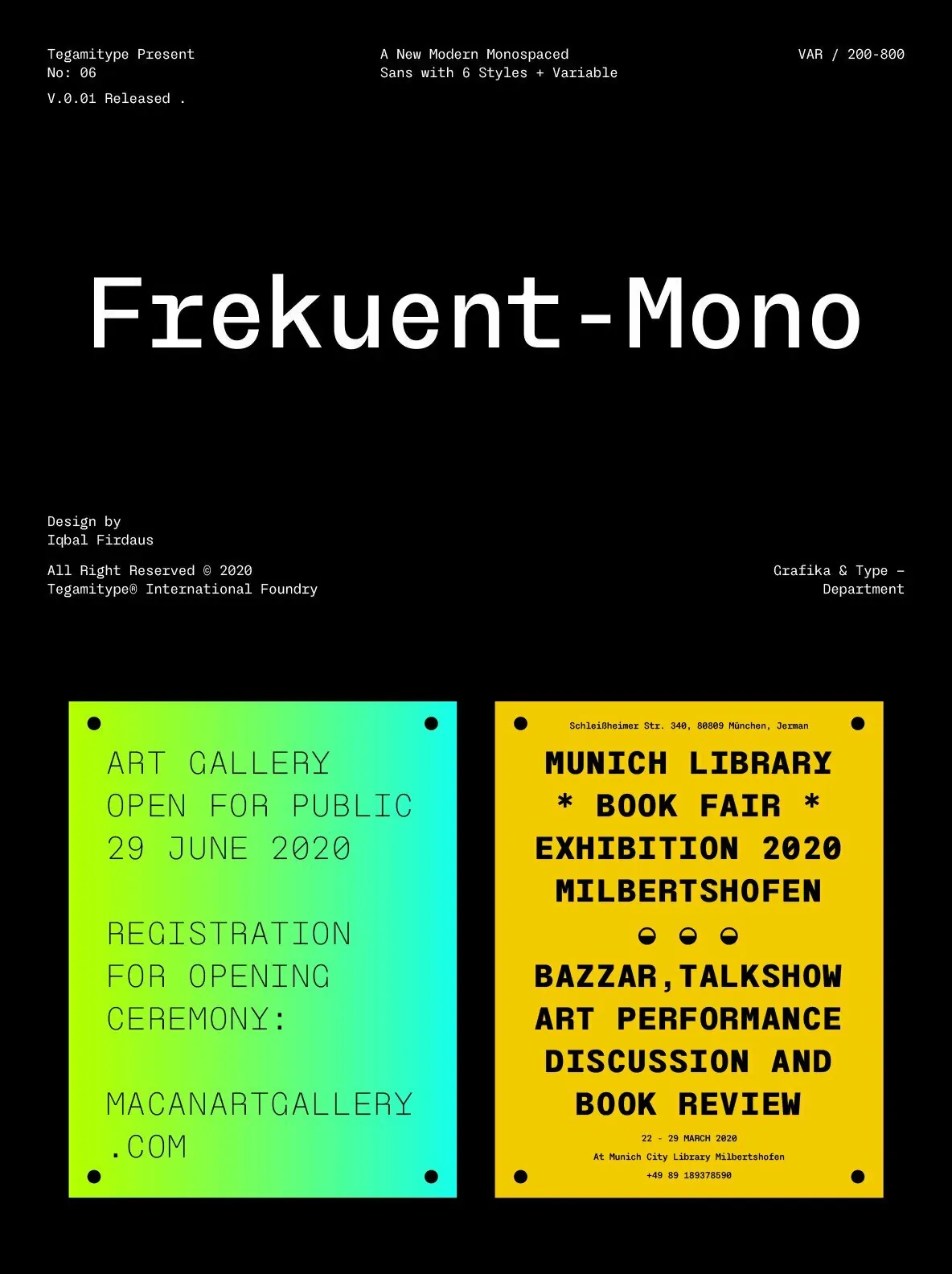
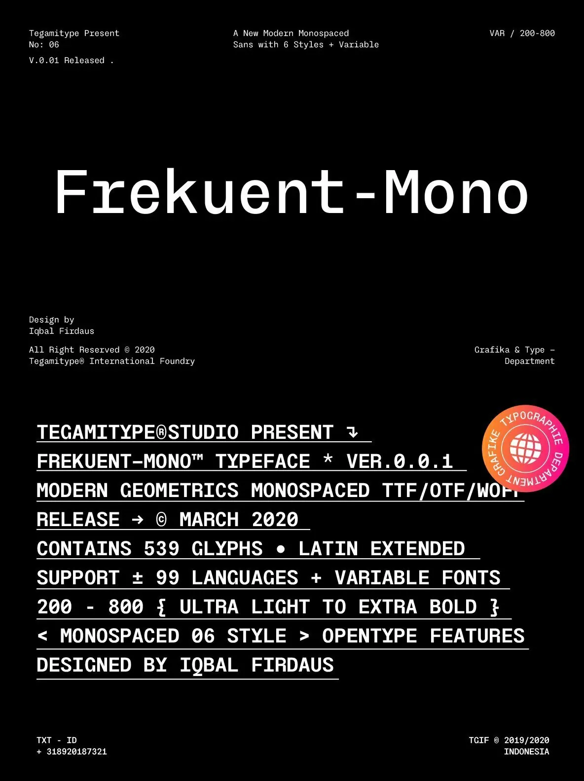
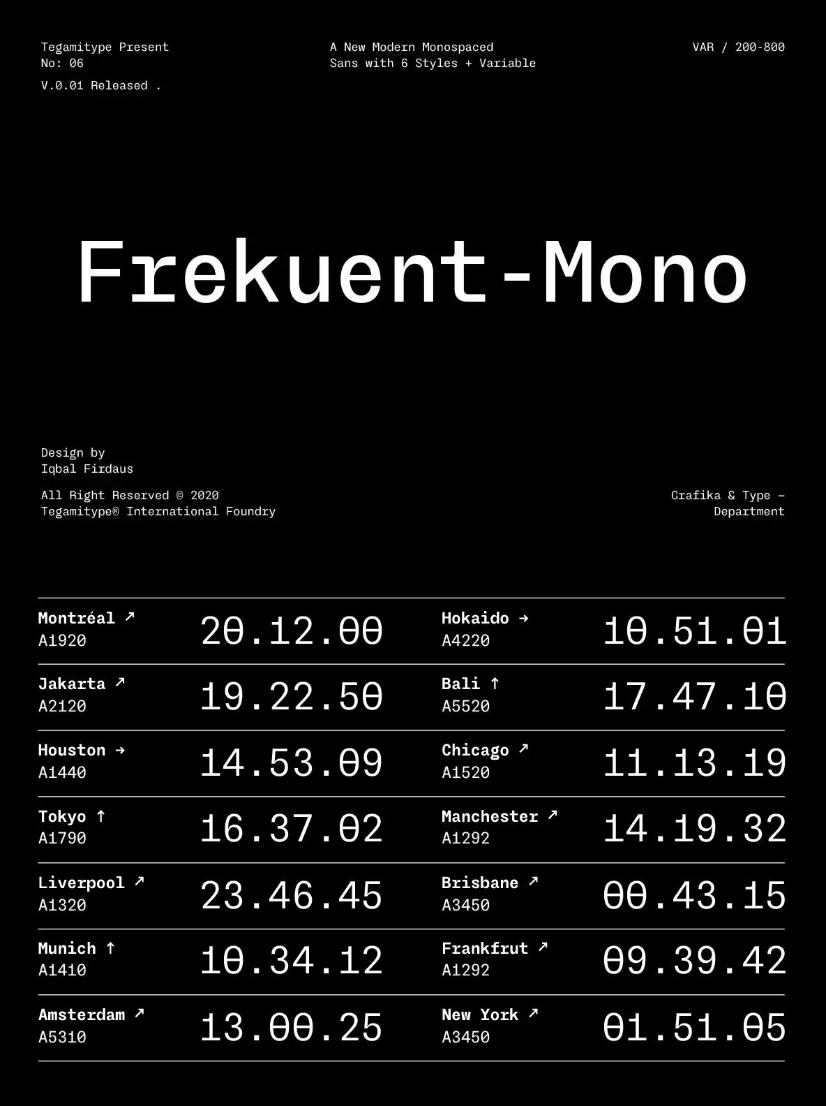
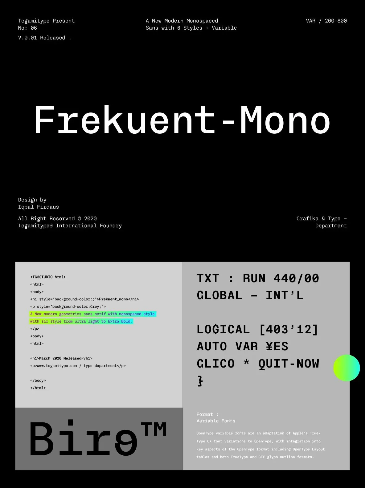
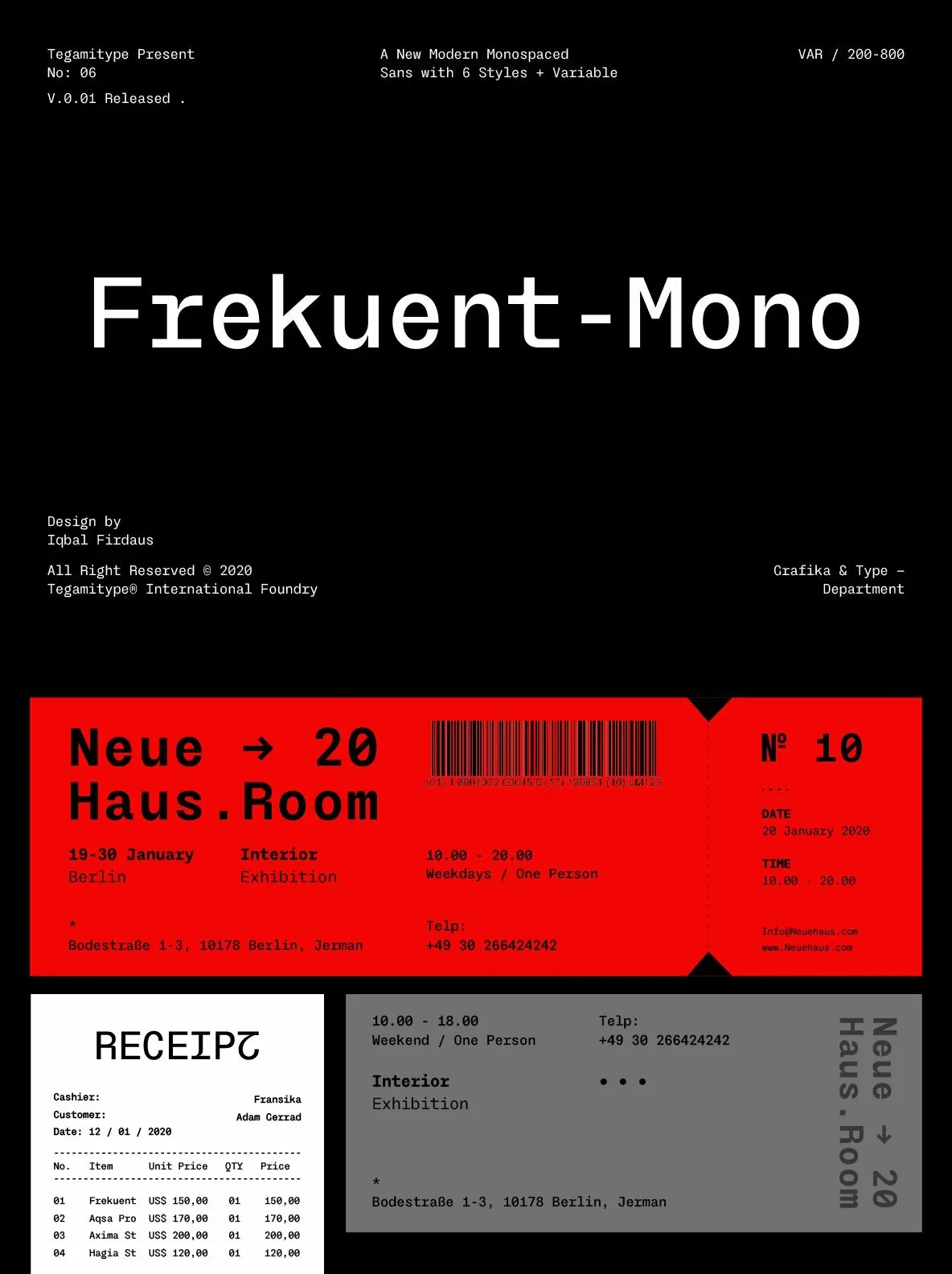
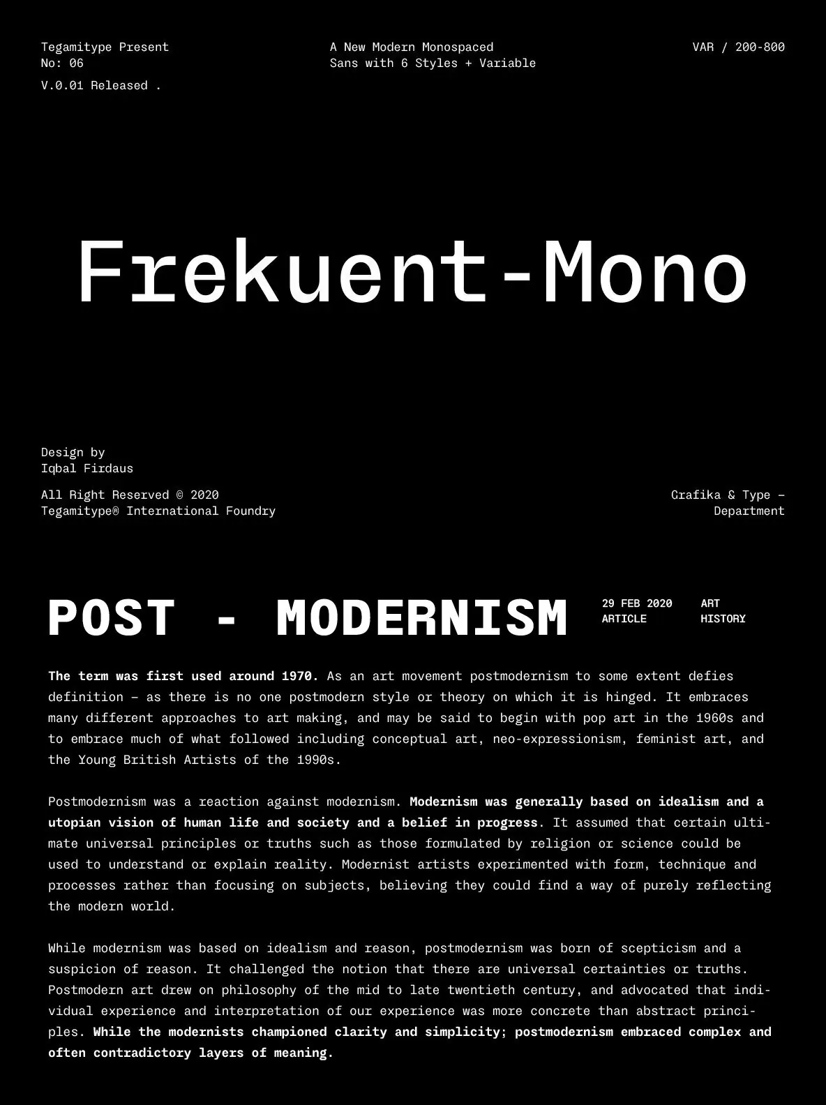
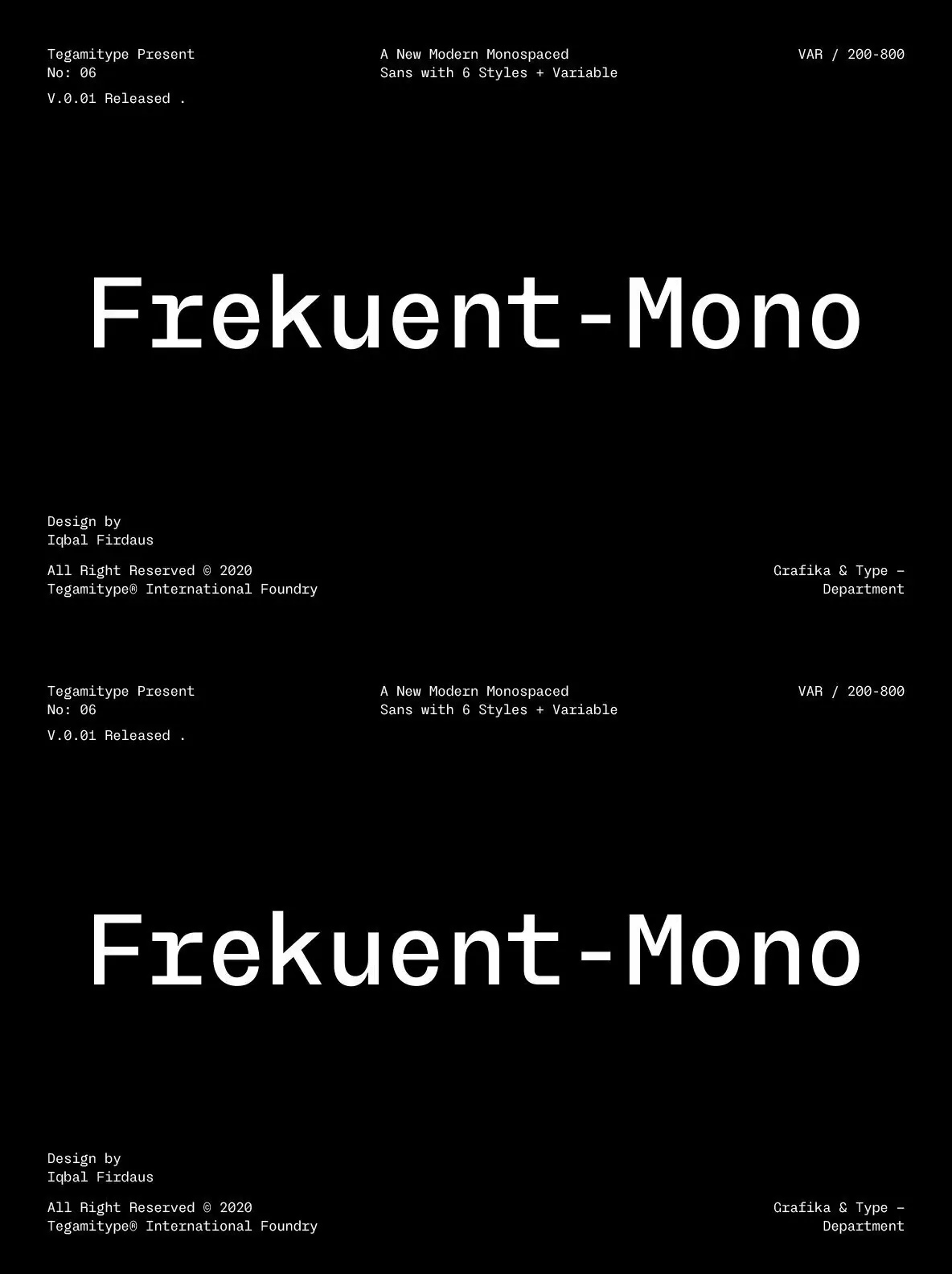
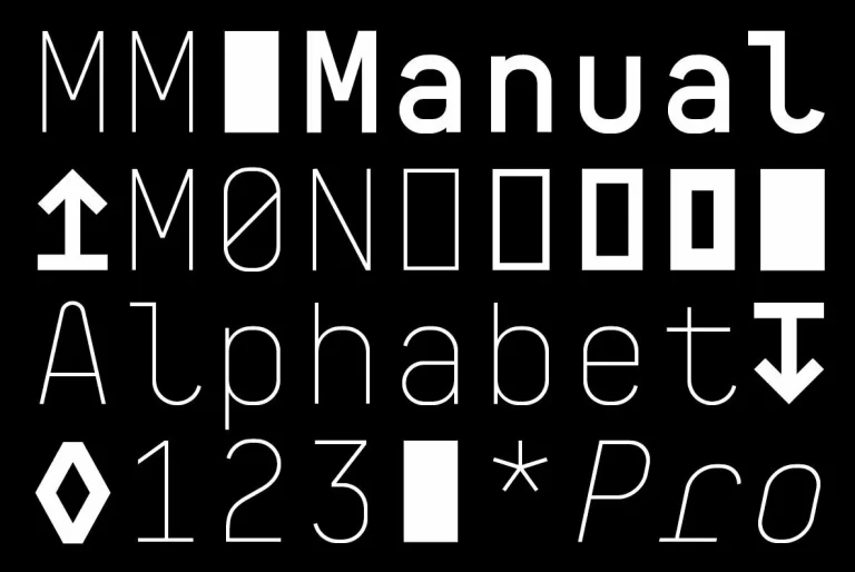
A modern geometric sans serif in a monospaced style, this family brings a structured rhythm to contemporary typography. Designed by Tegami Type, it suits interfaces, editorial layouts, and brand systems that need clarity and consistency. The range runs from ultra-light to extra-bold and includes one variable font, giving you practical control across sizes and screen conditions.
Built with high precision, the design reads as clean and organized, with a distinctly modern feel. Several stylistic alternates introduce a subtle twist—details inspired by characters from a script typeface. These alternates add a quirky, different note while still fitting the overall construction, so you can move between strict geometry and personality without leaving the system.
That balance makes it a strong choice for both body text and display text. It keeps lines disciplined and readable, while the alternates let you signal character when you need it. TG Frekuent Mono stays cohesive across weights, layouts, and typographic moods.