
Nova Klasse — Geometry with a Wink
Nova Klasse
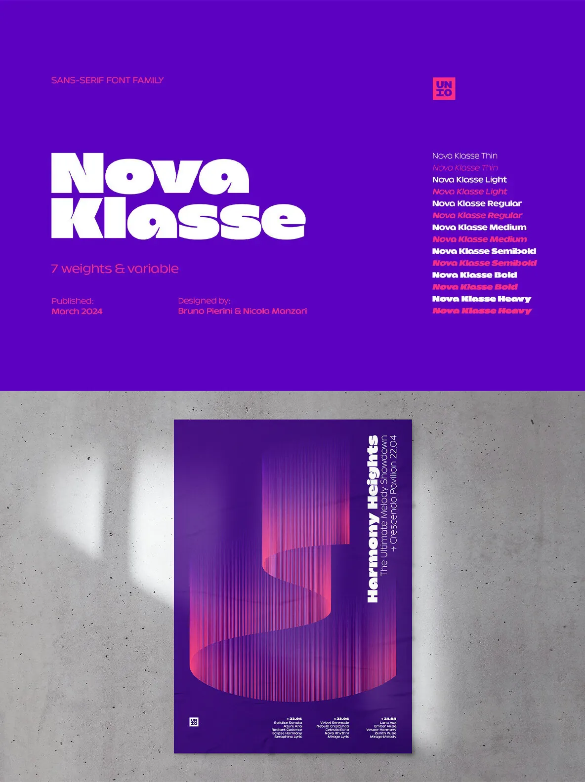
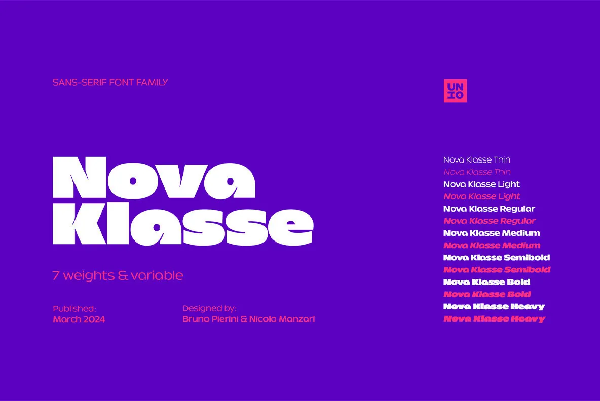
is a modern geometric sans serif with a clear point of view. It blends circular and rectangular forms for a distinctive silhouette, then softens the structure with organic drawing and unconventional details. The result feels warm, personable, and confident on the page.
Its playful tone sits on solid design principles—form, space, and viewer interaction—making it a natural fit for contemporary visual systems where typography must do more than carry content. Nova Klasse reads as modern without feeling cold, and it holds attention without forcing it.
Effortlessly Versatile with a Powerful Variable Font
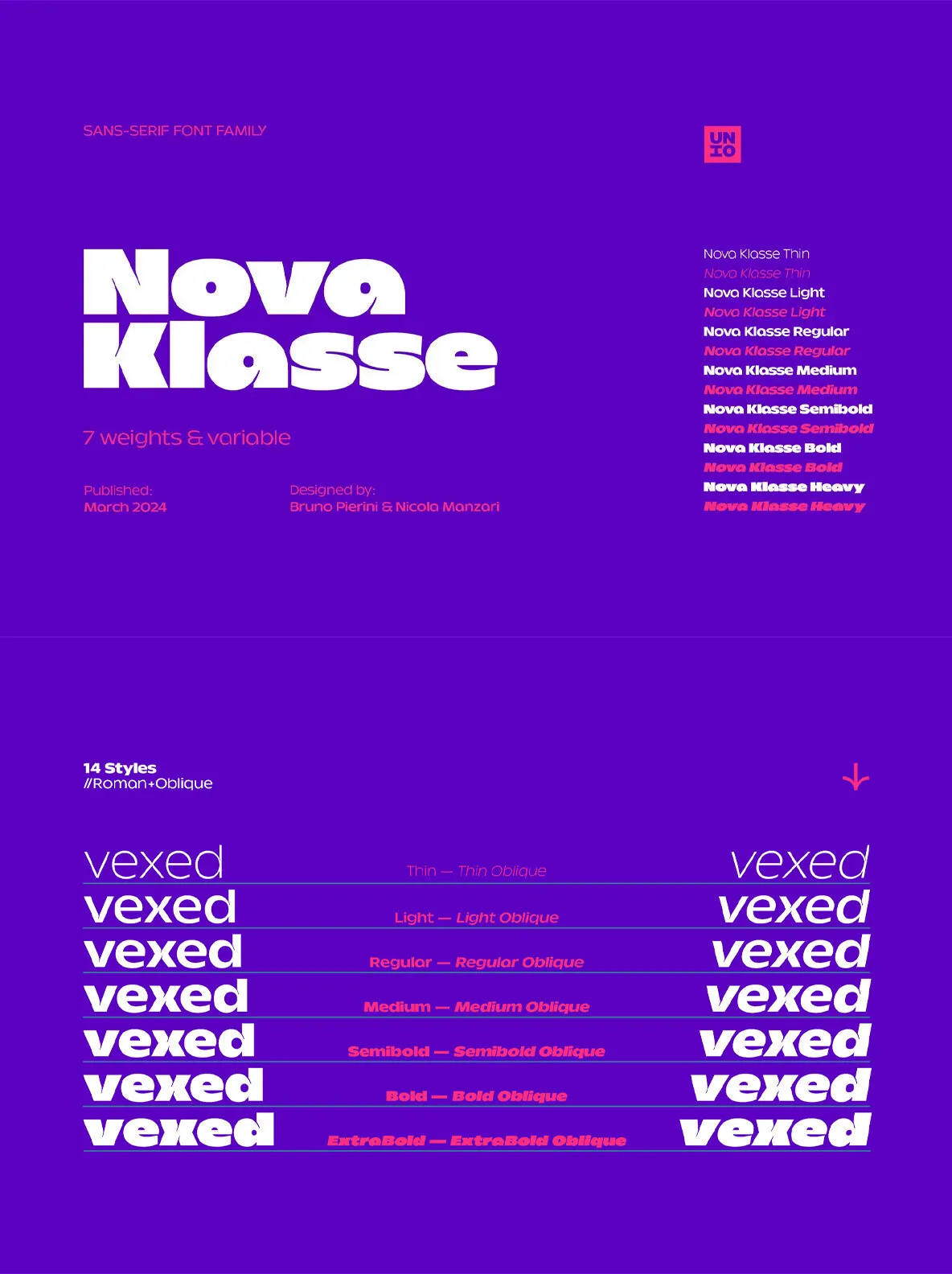
Nova Klasse supports easy personalization across a wide range of projects, from bold branding headlines to clear website copy. At the core is one 2-axes variable font that gives precise control over weight, with a smooth spectrum between Thin and Extrabold. Rather than relying on pre-set steps, you can dial in exactly the level of boldness or subtlety you need. A comprehensive set of OpenType features adds further nuance for tailored typographic results.
Pushing the Boundaries of Design
The design challenge behind Nova Klasse was to imagine its potential beyond the initial extra bold titling styles. That push toward versatility shaped a typeface that performs equally well when making bold statements or handling subtle, detailed work.
Makes a Statement, Reads with Ease, Prints Beautifully
Nova Klasse works confidently in both digital and print applications. Bold styles stand out in headlines and logos, while the text weights stay readable for websites and dense copy. Strategic ink traps help prevent ink build-up during printing, supporting clean, crisp reproduction across media.
Specifications
Files included:
Nova Klasse Variable, Nova Klasse Static
7 weights
with matching
obliques
Multi-language support
(Central, Eastern, Western European languages)
OpenType Features
(Superscript and Subscript Numerals, Fractions, Alternates)