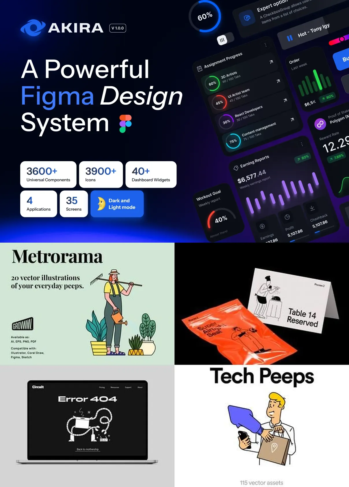
Introducing AkiraUI Kit Design System v10, the most advanced, future-ready design system engineered for enterprise-grade web and mobile applications. Designed for product teams, UI/UX designers, and frontend developers who demand precision, speed, and adaptability, AkiraUI v10 isn’t just a collection of components—it’s a complete design and development ecosystem. With over 400+ fully interactive, modular components, 20+ production-ready templates, and a responsive foundation built on atomic design principles, AkiraUI eliminates repetitive work, accelerates prototyping, and ensures pixel-perfect consistency across every screen and device.
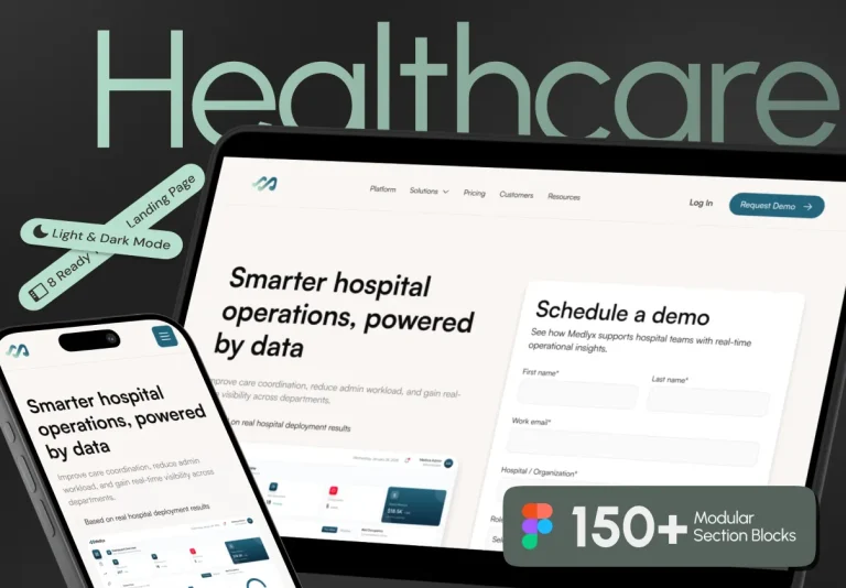
Whether you’re building SaaS platforms, fintech dashboards, healthcare portals, or e-commerce ecosystems, AkiraUI v10 delivers a balanced fusion of aesthetics, functionality, and performance. Its clean, geometric structure, intentional whitespace, and dynamic micro-interactions empower teams to create interfaces that are not only visually striking but also highly intuitive and accessible.
Master Every Layer of the Digital Experience – From Component to System
Core Components: The Building Blocks of Innovation
Every element in AkiraUI v10 is meticulously crafted for reusability, scalability, and developer readiness. The component library includes advanced inputs, data tables, navigation patterns, modals, form states, loading indicators, notifications, cards, and custom widgets—all designed with accessibility in mind and ready for immediate implementation.
- Dynamic Input Fields: Multi-state fields with real-time validation, error handling, placeholder animations, and keyboard-friendly navigation.
- Smart Data Tables: Sortable, filterable, and searchable tables with pagination, sticky headers, and collapsible rows for large datasets.
- Global Navigation & Sidebar Systems: Responsive menus, nested sidebars, collapsible navigation panels with animation support.
- Interactive Feedback Elements: Toast notifications, progress bars, loading spinners, confirmation dialogs—all with customizable themes and transition effects.
- Accessibility-First Design: Semantic HTML structure, ARIA labels, keyboard traversal, screen reader compatibility, and contrast-ready color schemes.
Design Tokens & Theme Engine: Build Brand-Consistent Apps in Minutes
Empower your brand identity with AkiraUI’s powerful design token system. Easily customize colors, typography, spacing, shadows, and transitions to match your company’s visual language. The modular theme engine allows for instant switching between light, dark, high-contrast, and custom brand themes—all without breaking component functionality.
- Centralized JSON-based design tokens for consistent scaling across projects.
- Support for system-wide theme sync across web, mobile, and desktop applications.
- Automated color contrast checks and WCAG 2.1/2.2 compliance validation.
- Pre-built theme variants: Default, Dark Mode, Minimal, Corporate, Vibrant.
Engineered for Developers: Seamless Integration & Future-Proof Development
Frictionless Handoff from Design to Code
AkiraUI v10 is not designed in isolation—it’s built for collaboration. Every component is tagged, named, and structured for smooth handoff between design and development teams. Supporting export to Figma, Sketch, Adobe XD, and React, the system ensures that every visual detail—from spacing to transitions—is preserved during implementation.
- React Component Library: Ready-to-use React hooks and functional components compatible with Next.js, TypeScript, and Vite.
- Auto-Generated Prop Types: Clear documentation and type definitions for seamless integration into codebases.
- Component Storybook: Interactive documentation with live previews and customizable examples.
- NPM Package Support: One-click install with full versioning and dependency management.
- Responsive Auto-Layouts: Components adapt dynamically to mobile, tablet, and desktop breakpoints without manual adjustments.
Accelerate Time-to-Market, Boost Product Quality, and Scale with Confidence
Deploy Faster. Ship Better. Evolve Smarter.
Why build from scratch when you can launch with a system engineered for excellence? AkiraUI Kit Design System v10 reduces initial development time by up to **70%**, minimizes design debt, and ensures consistency across every feature and release. Use it to:
- Build enterprise applications with consistent UX patterns and reduced user confusion.
- Scale product teams by standardizing design systems across multiple projects and departments.
- Onboard new designers and developers quickly with a shared, documented language.
- Integrate AI-powered UI suggestions, style guide automation, and real-time collaboration tools.
- Future-proof your product with continuous updates, security patches, and performance enhancements.
With AkiraUI Kit Design System v10, you’re not just adopting a toolkit—you’re adopting a philosophy of efficiency, clarity, and craftsmanship. Whether you’re leading a startup’s product launch or managing a global enterprise design operation, AkiraUI gives you the precision and power to build digital experiences that endure, perform, and delight.