Gelatic Font
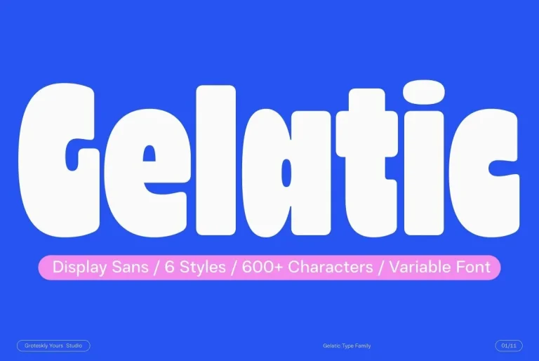
Gelatic — Whimsy with a Heroic EdgeGelatic is a display sans serif type family with a lively, whimsical tone. It comes in six distinct styles, plus a variable font option, so it adapts easily to different design needs. Its almost…


Gelatic — Whimsy with a Heroic EdgeGelatic is a display sans serif type family with a lively, whimsical tone. It comes in six distinct styles, plus a variable font option, so it adapts easily to different design needs. Its almost…
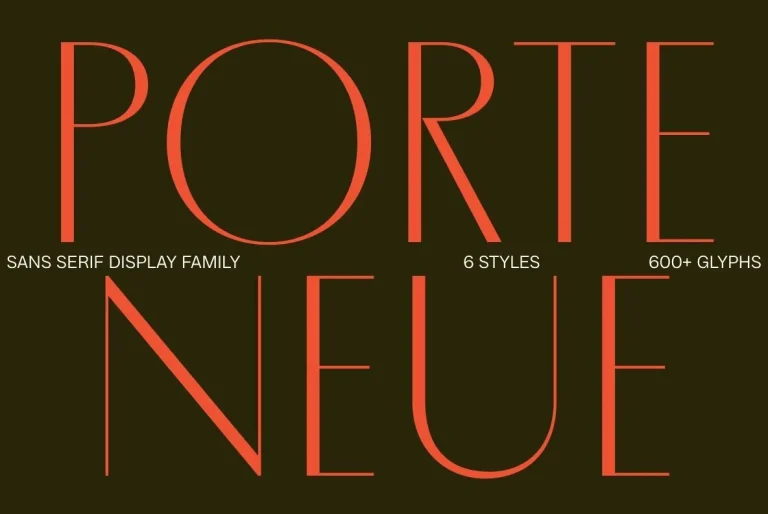
Porte Neue — Plaque-Carved Poise, RecastPorte Neueis an elegant font family in 6 styles, released by Groteskly Yours Studio. Originally released as Porte in 2019, this updated 2025 version refines its classic outlines while expanding the family to six styles…

Rothek Stencil — Geometry, with a CutRothek Stencil is a stencilled grotesk released by Groteskly Yours in 2022. It builds on Rothek, the geometric sans serif released through Groteskly Yours, and keeps the original proportions and structure of the family.…
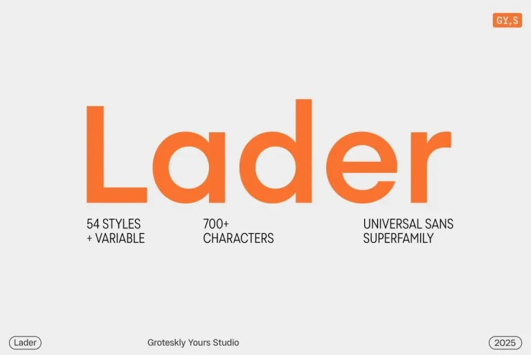
Lader — Quiet Geometry, Built to ReadLader is a geometric sans serif type family designed for clarity, versatility, and contemporary design environments. With 90 styles across Condensed, Compact, Standard, Wide, and Expanded subfamilies—ranging from Thin to Black with matching italics—Lader…

YWFT Processing was developed in 2001 for Casey Reas, the co-creator of the Processing programming language. We created this display face to be sharp, tall, unique and interesting…much like Mr. Reas himself. The font was derived from an original logo…

Embrace the Mechanical Elegance of YWFT MoteurDiscover the unique charm of YWFT Moteur, a typeface that began its journey as a technical and retro design reminiscent of mechanical workmanship. Its evolution from Alloy to the later version, YWFT Maetl, marks…

YWFT 6x7oct — Octagonal Type in MotionYWFT 6x7oct is drawn solely from octagonal shapes, giving the typeface a strict geometric logic and a distinctly engineered presence. Its forms blend influences from punch cards and electronic devices, resulting in letterforms that…

YWFT Enam’s letterforms were originally created for a branding job, then developed as a font, and finally converted to Opentype format in 2010. Some similarity to past work by Wim Crouwel is evident, which comes as no surprise, given our…

YWFT OneCross: A Bold Typeface for Futuristic DesignYWFT OneCross is a striking typeface built entirely from plus signs of varying weights, creating a visually arresting and unique typographic style. Originally developed from YWFT OverCross in 2002, the font was reimagined…

YWFT OverCross originally started as a typeface design that set out to explore visual form while retaining legibility. At close range, YWFT OverCross is visually beautiful but rather unreadable. Take a step back, however, and it becomes completely legible, perfect…