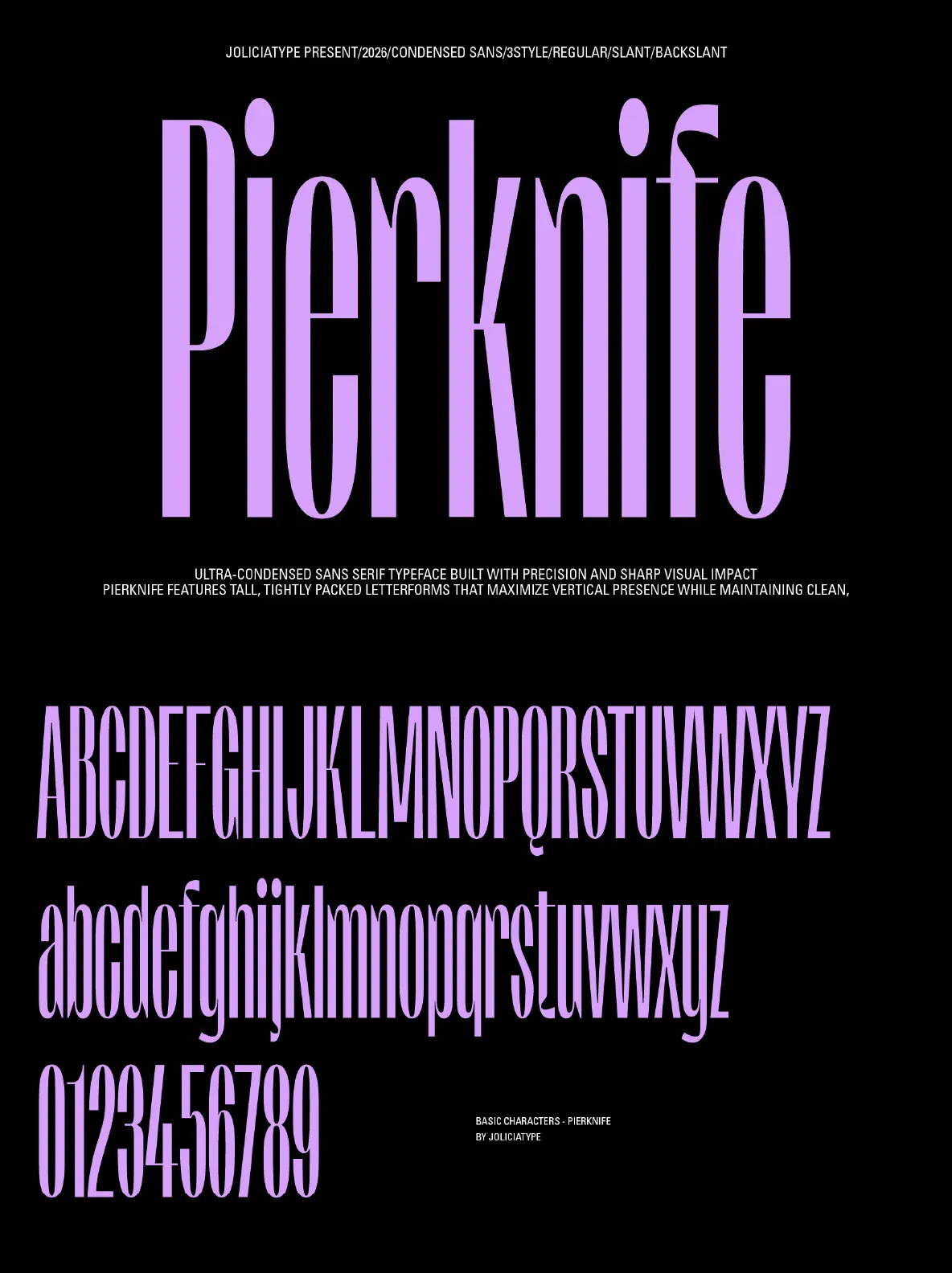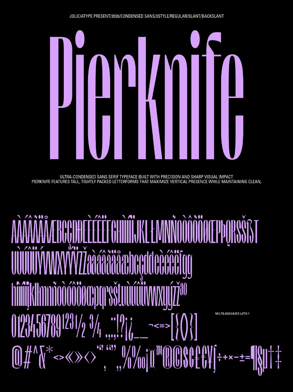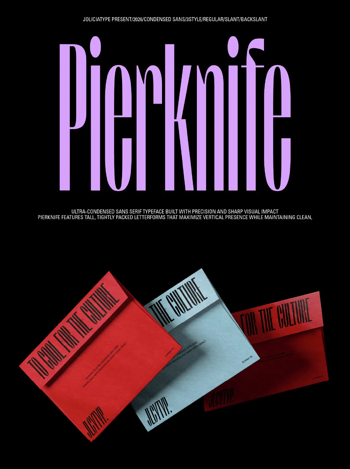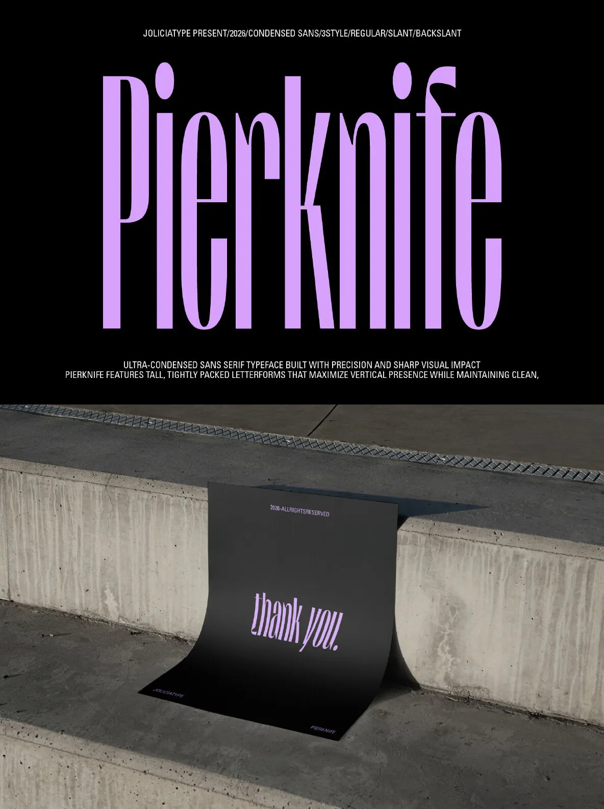

Pierknife: Ultra-Condensed Sans Serif With Ink-Trap Detail
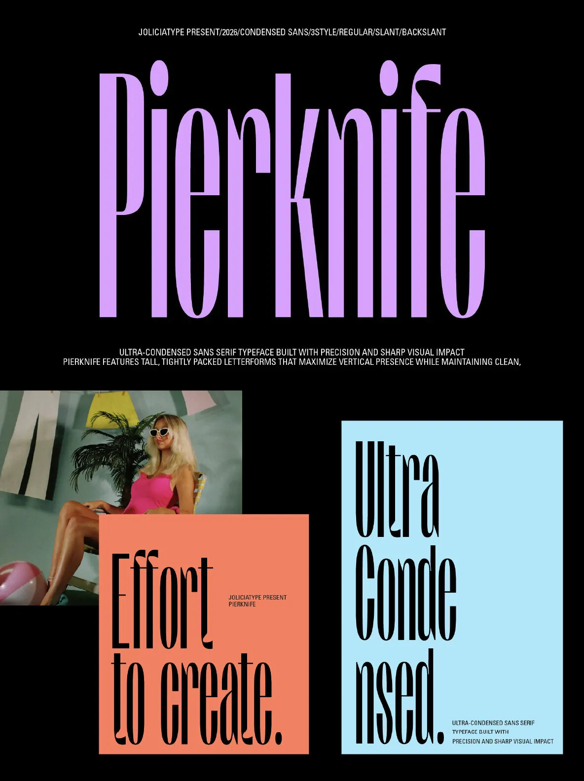
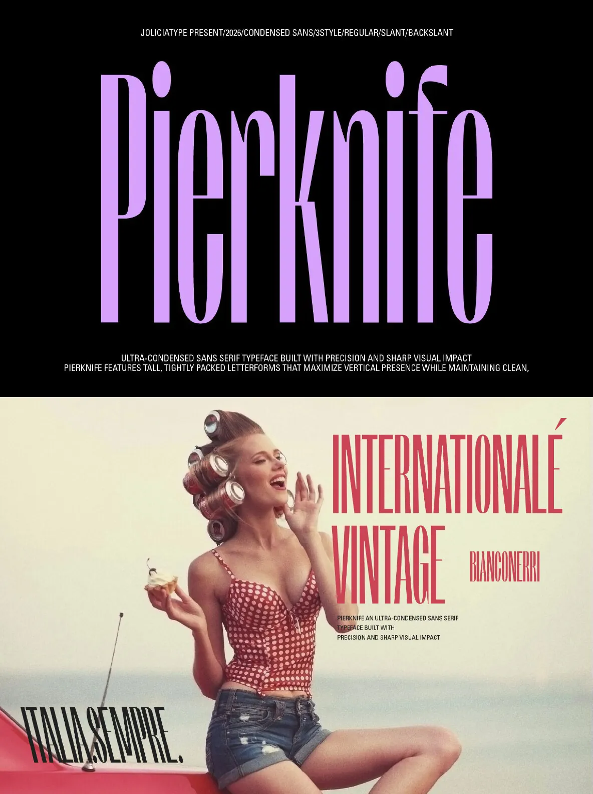
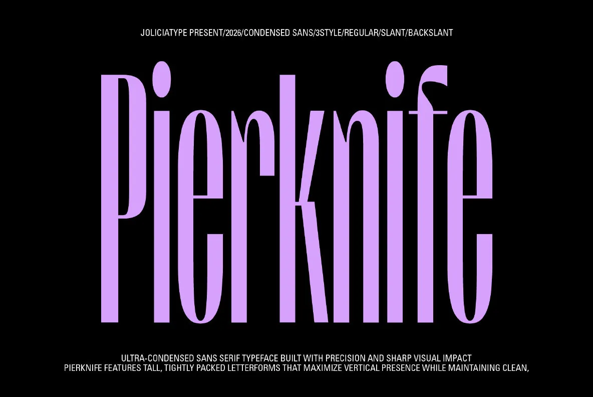
Built for designers who need height, compression, and clarity without losing personality, this ultra-condensed sans serif balances thin, tall proportions with a steady internal rhythm. It reads modern and precise, yet a faint vintage pull keeps it from feeling clinical. As a headline typeface, it holds narrow columns with authority—ideal for posters, editorial spreads, packaging, and identity systems where space is tight and the typographic voice must carry.
Jolicia Type draws the letterforms with crisp edges and carefully engineered ink traps. This technical detail supports legibility at small sizes and adds a subtle industrial accent. The cuts are functional, not decorative. They help counters stay open in print and on screen, and they give the design a tactile edge that fits minimalist layouts as well as retro-leaning compositions. It can sit cleanly in a contemporary grid or take on a more nostalgic tone with grain textures, muted palettes, or period-inspired photography.
Features
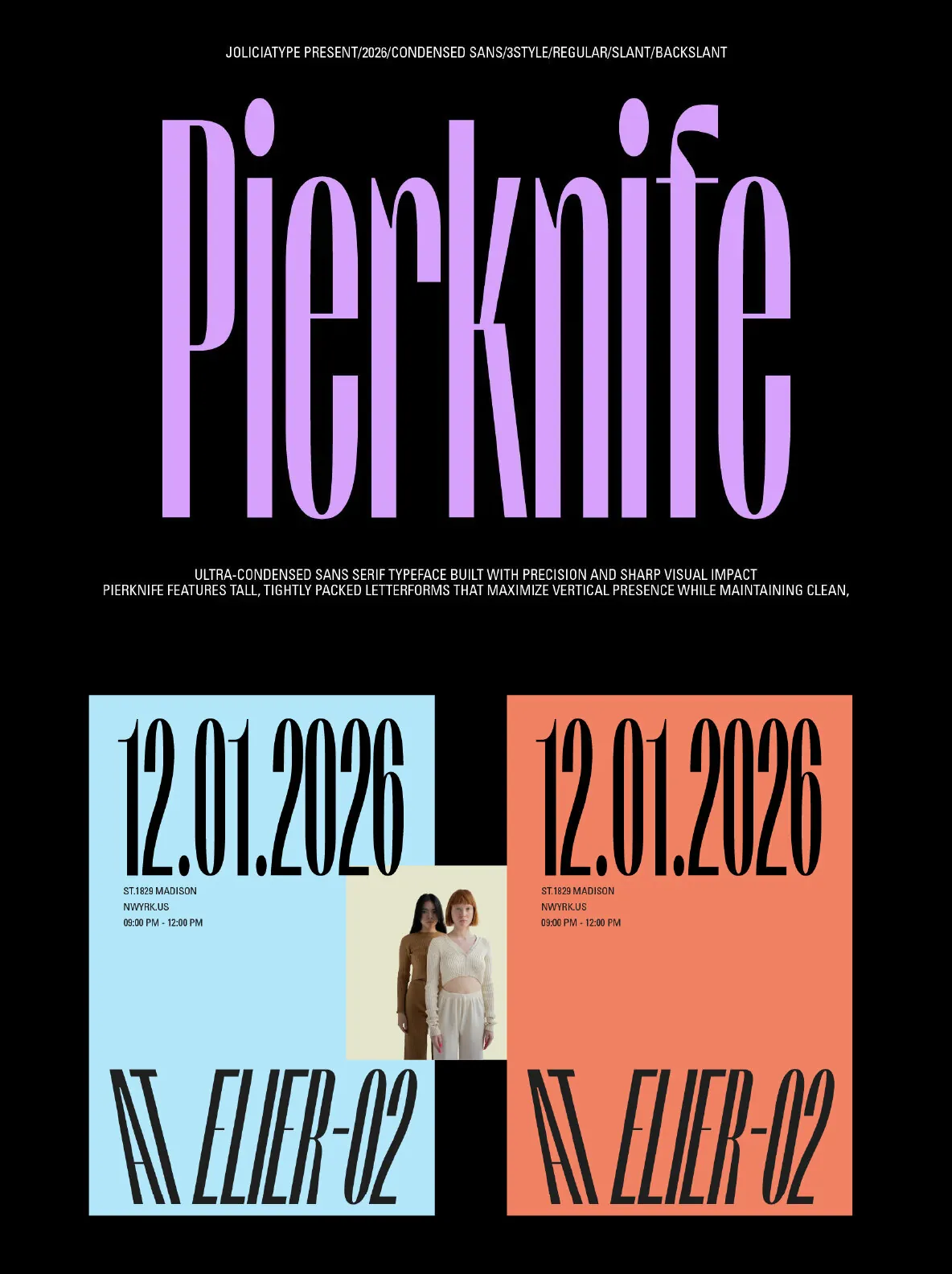
Upright: stable, clear, and direct for modern branding and editorial systems
Slant: forward-leaning energy for motion, urgency, and high-impact headlines
Back Slant: reverse tilt for a distinct retro attitude and an off-center edge
That directional range makes Pierknife practical for identity families that need contrast without changing the basic typographic DNA. If you’re building a system around an ultra-condensed sans serif—one that can feel sharp in contemporary layouts and convincingly tactile in vintage settings—Pierknife offers a disciplined structure with enough character to stay memorable.