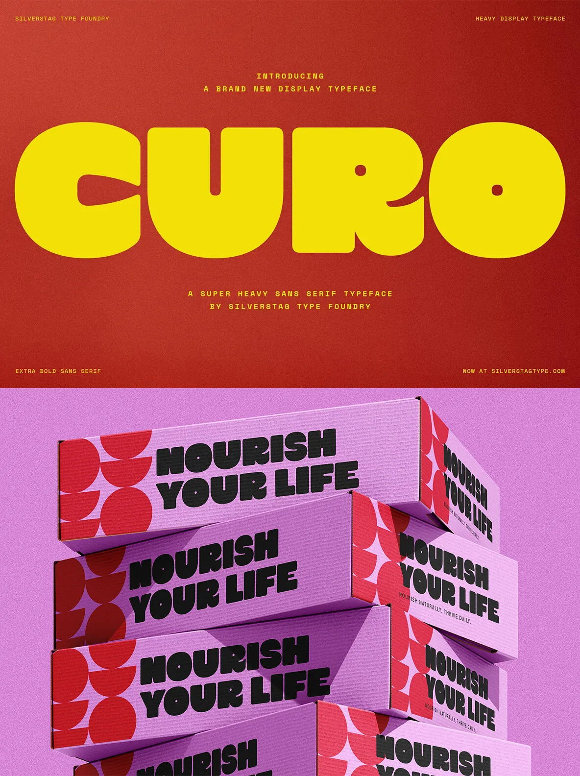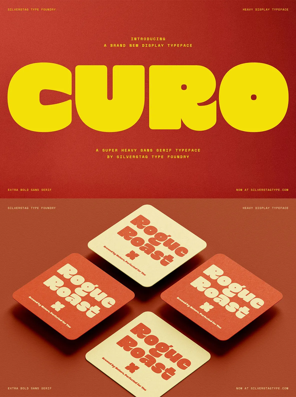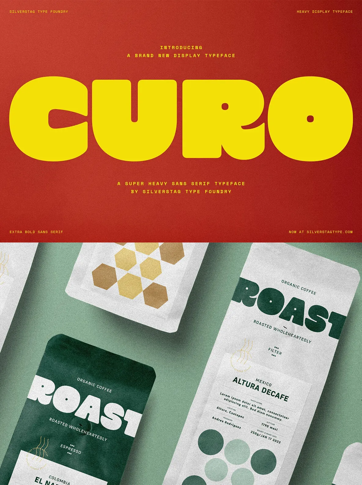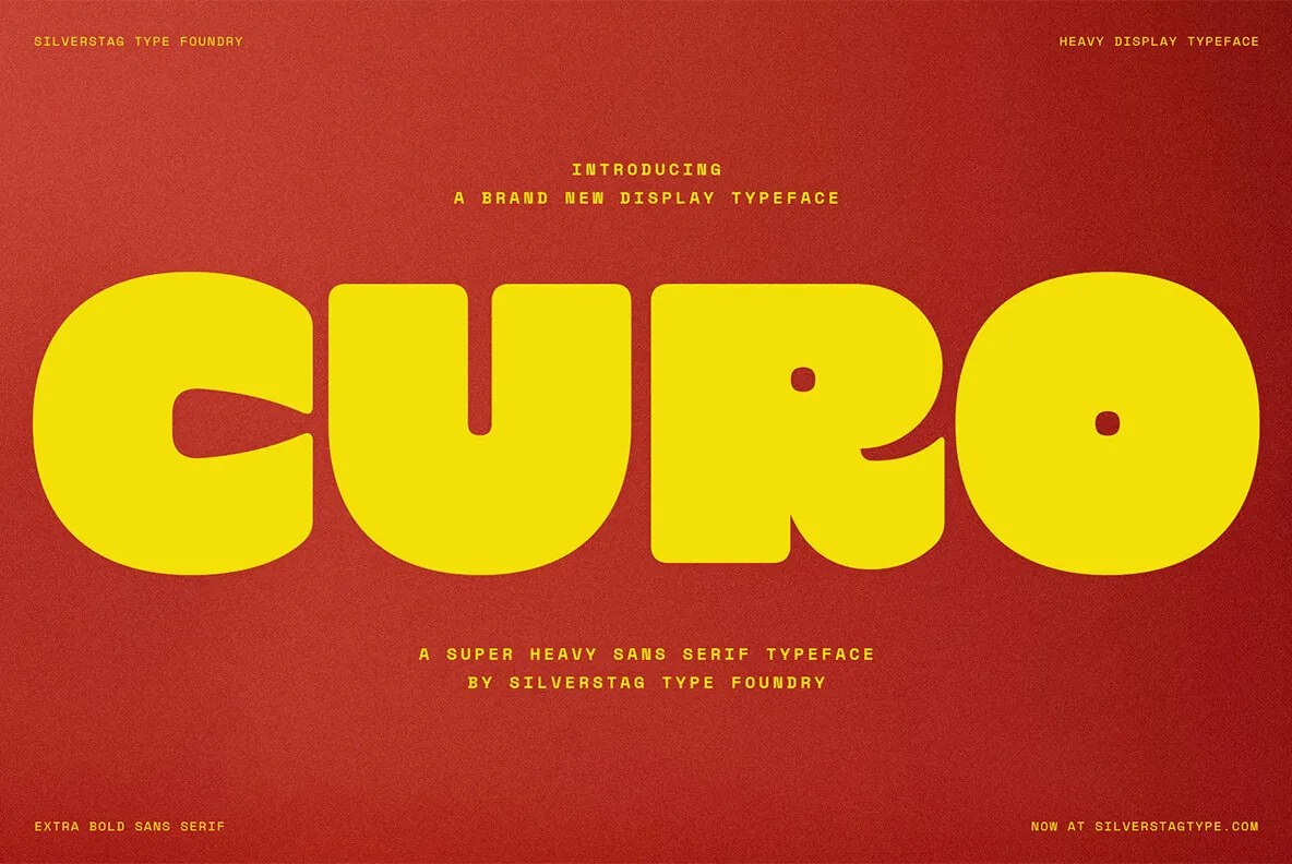

SLTF Curo — One Weight, Five Attitudes
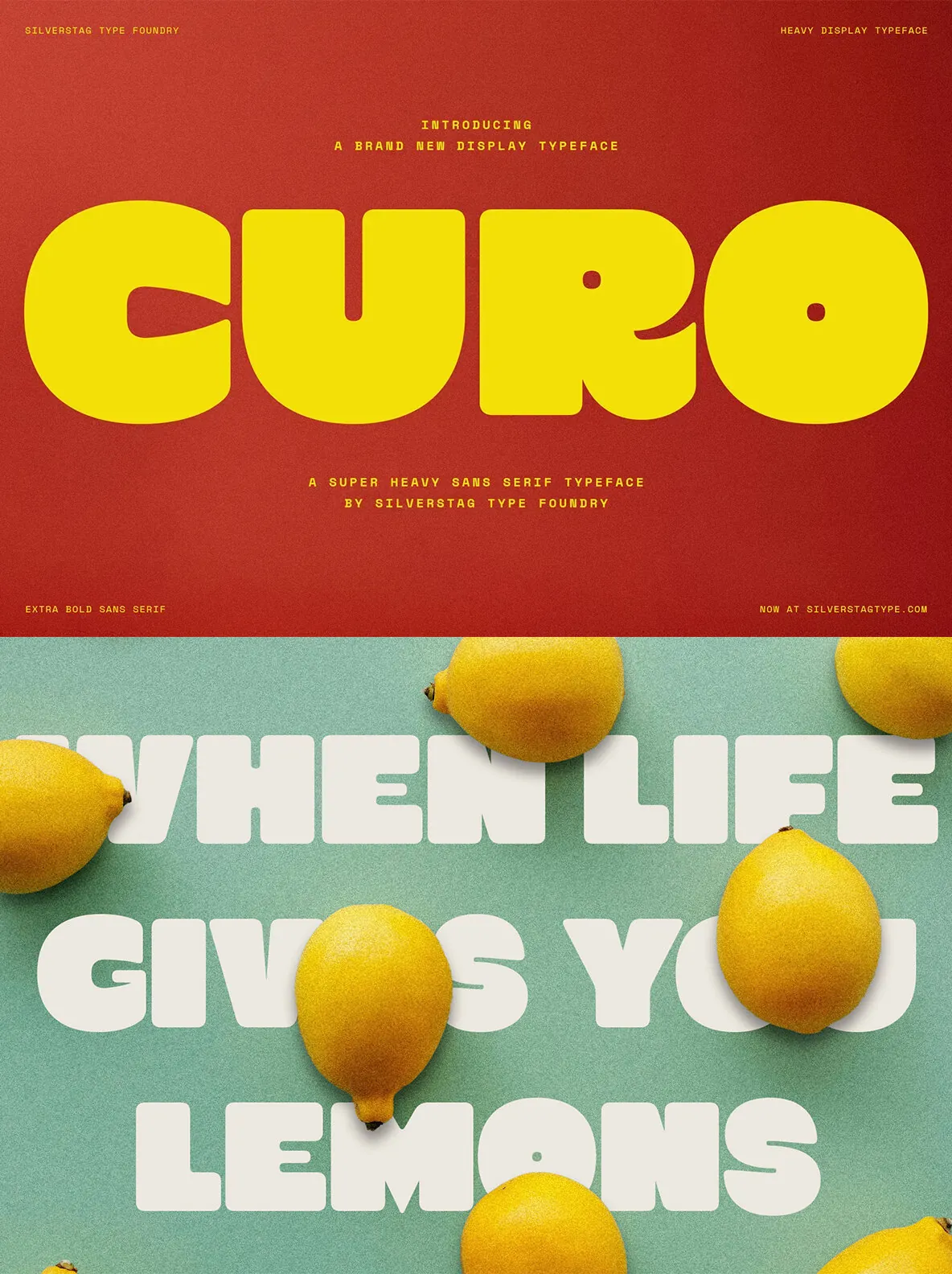
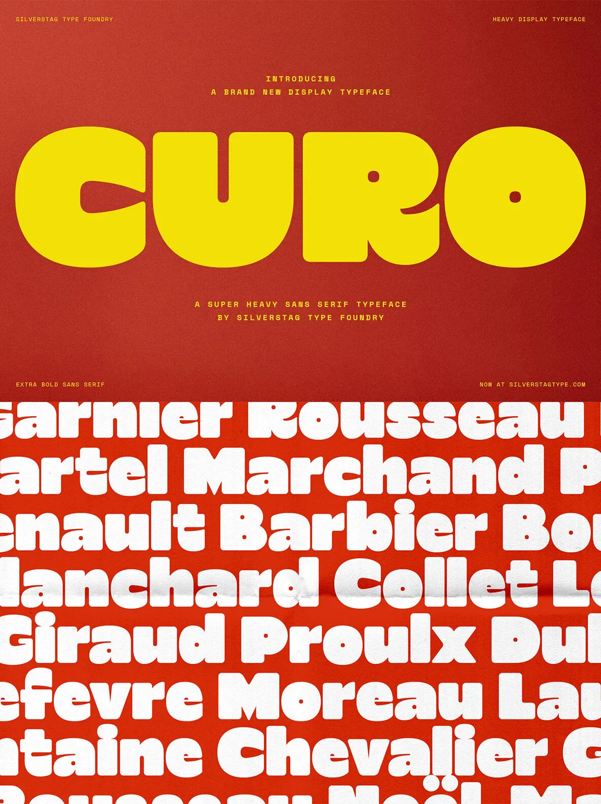
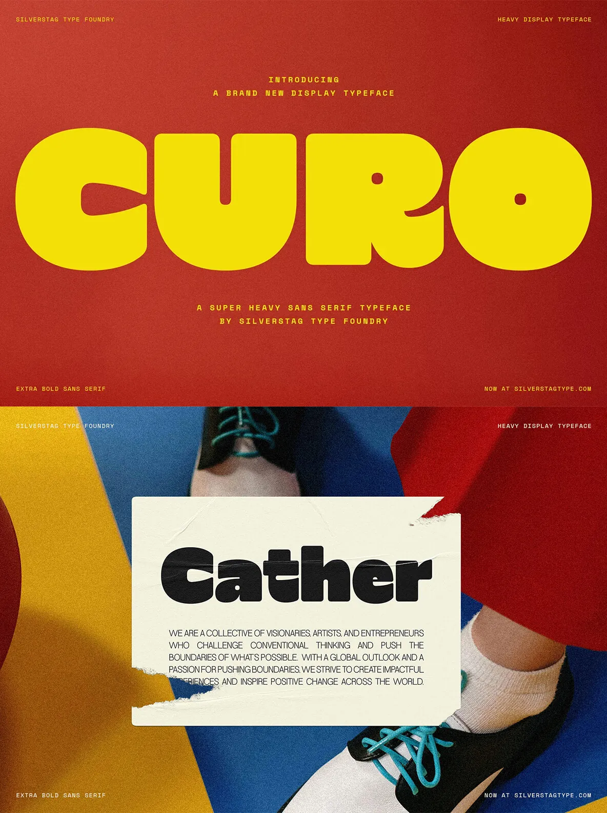
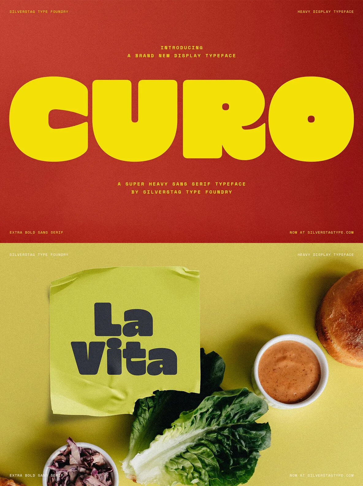
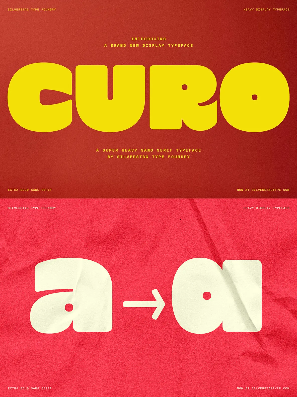
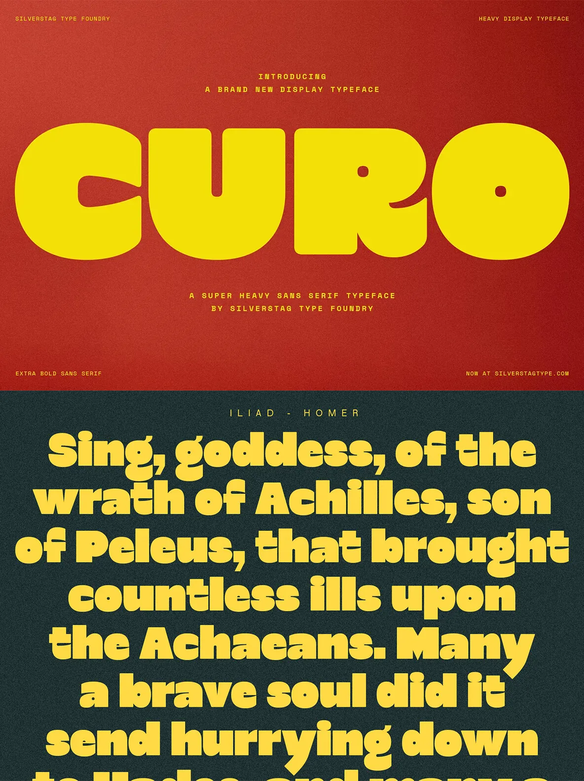
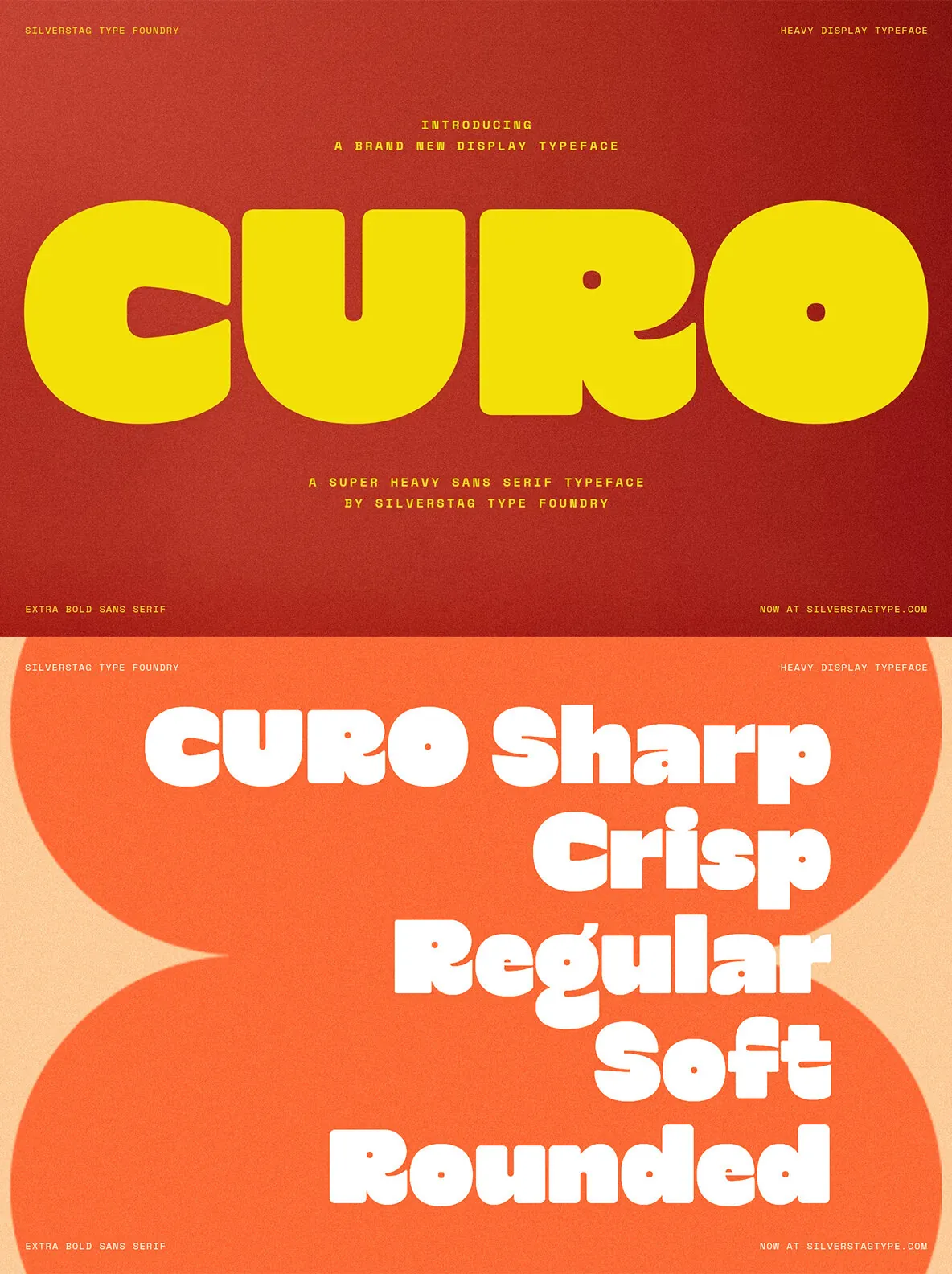
SLTF Curo is a Heavy Display Typeface built around one uncompromising idea: a single extreme weight should carry any brand in any direction, without compromise. It comes in five corner style variants, giving designers precise tonal control while keeping a cohesive family look.
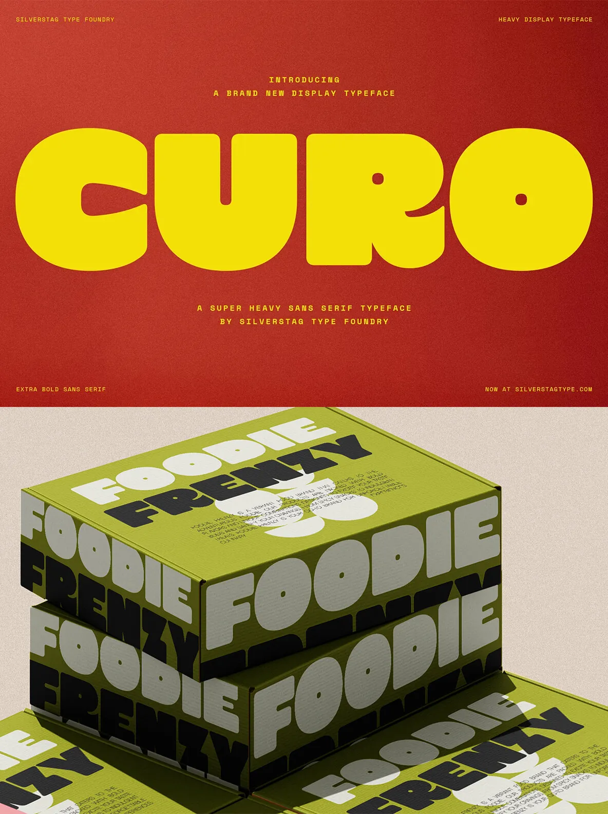
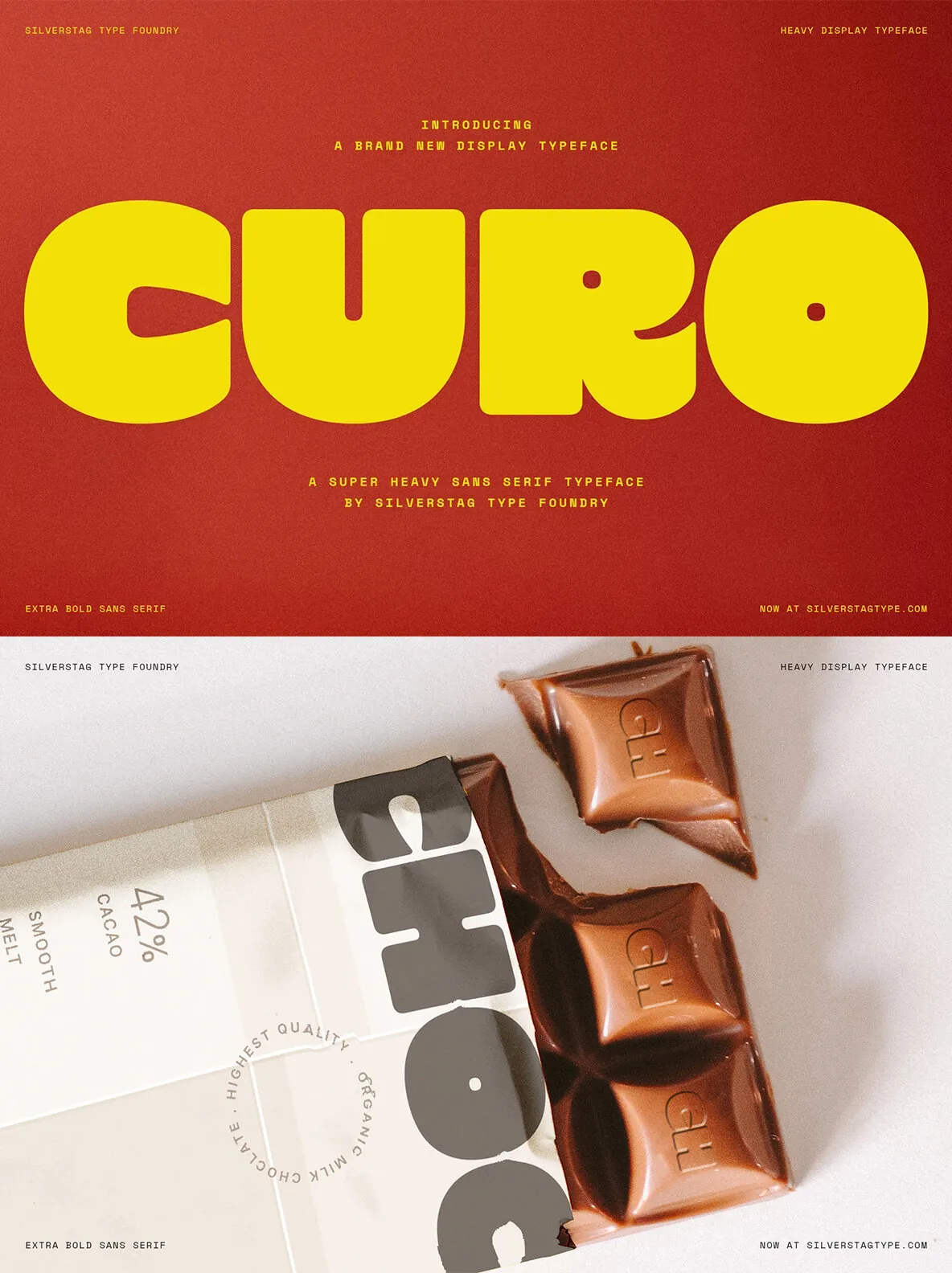
Every variant shares the same super heavy mass, large x-height, and tight counter structure. What changes is the corner—and with it, the entire personality of the typeface. Use SLTF Curo for bold brand identity work, high-impact headlines, and graphic systems that need consistency without sameness.
THE FIVE STYLES
Curo Sharp — hard-edged, angular, high tension. Built for streetwear, music, and brands that don’t soften anything.
Curo Crisp — slightly eased corners with all the sharpness intact. A refined edge for editorial and premium brand design.
Curo Regular — the balanced center. Confident and versatile without leaning in either direction.
Curo Soft — warm and approachable, with enough weight to still command attention.
Curo Rounded — full, voluminous, almost tactile. The kind of bold that feels friendly and powerful at once.
WHAT IT’S BUILT FOR
Brand identity and logo design
Packaging and product labels
Posters and event collateral
Editorial headlines and magazine layouts
Apparel, merchandise, and print
Social media and digital campaigns
DESIGN DETAILS
Curo’s large x-height and tight counters ensure maximum visual impact at display sizes. A distinctive lowercase ‘g’ and an alternate single-story ‘a’ add typographic character beyond a straightforward heavy sans. The overall construction is retro-modern—expressive without being decorative, bold without being blunt.
The five-style system works as a complete design toolkit. Each variant feels distinct enough to carry a different brand energy, yet cohesive enough to layer across one project for controlled typographic contrast.