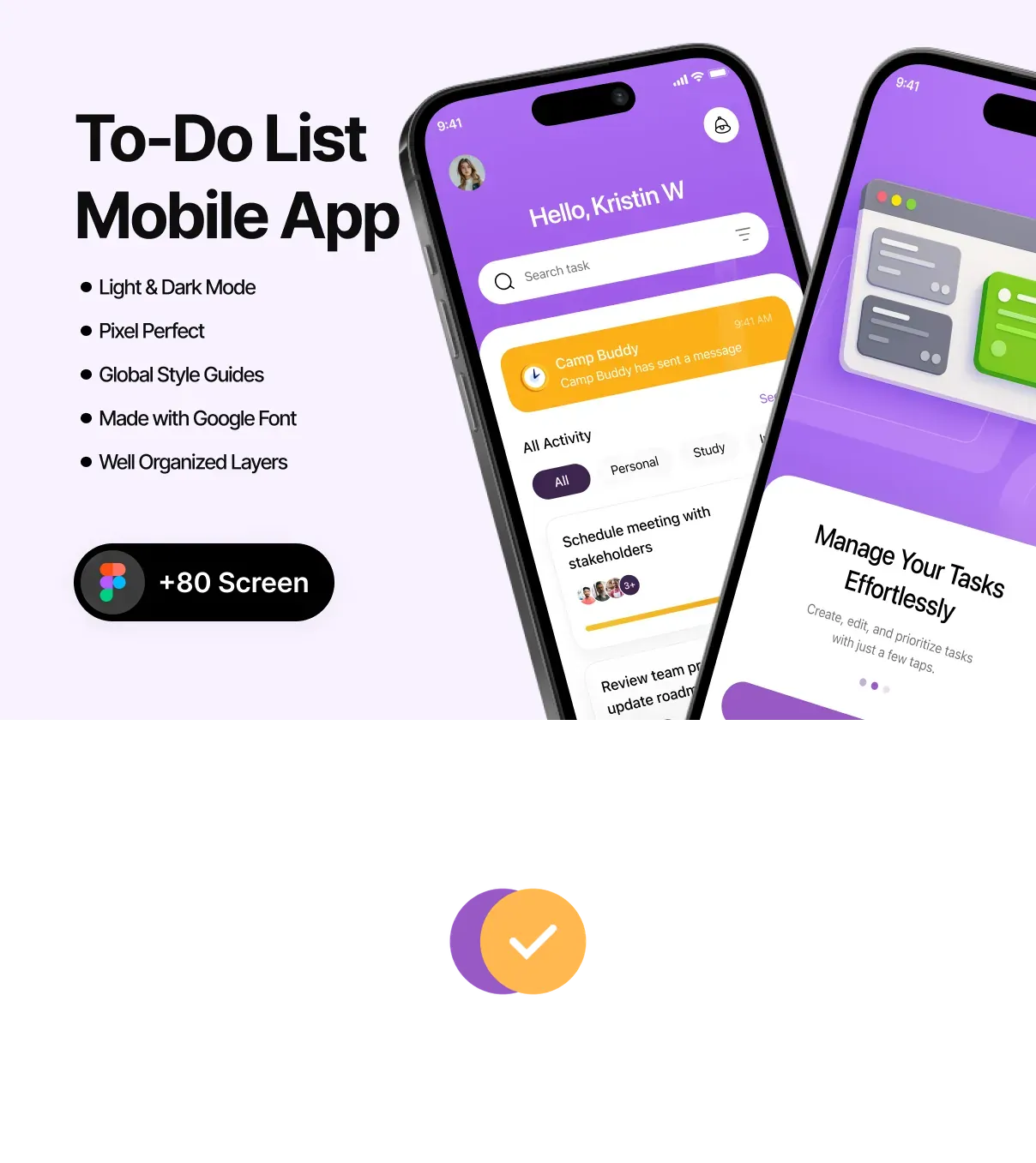
This UI kit delivers a sleek, distraction‑free design language crafted specifically for task‑management applications. Built in Figma, the kit provides a fully responsive, pixel‑perfect visual system that balances simplicity with powerful functionality. Every screen, component, and interaction is engineered to help designers and developers launch a polished To‑Do List app in days rather than weeks, while preserving the modern aesthetic that users expect on iOS and Android platforms.
Key Benefits
- Rapid Time‑to‑Market: All screens are pre‑designed, layered, and ready for Auto‑Layout, allowing teams to assemble complete user flows with minimal effort.
- Consistency & Scalability: A unified component library and design tokens ensure visual harmony across the entire app and simplify future feature expansions.
- Developer‑Ready Assets: Exportable SVG icons, optimized PNGs, CSS snippets, and JSON tokens streamline hand‑off to SwiftUI, Jetpack Compose, React Native, or Flutter codebases.
- Focus on User Experience: Minimalist layouts, clear hierarchy, and subtle micro‑interactions keep users organized and motivated to complete their tasks.
Screen Library
Comprehensive User Flow Coverage
The kit includes 30+ high‑resolution screens that cover every stage of a To‑Do List app lifecycle:
- Onboarding & Authentication: Welcome splash, tutorial carousel, email/social sign‑up, password recovery, and biometric login.
- Dashboard & Task Management: Overview of daily tasks, categorized lists, priority tags, swipe‑to‑complete gestures, and quick‑add floating button.
- Task Detail & Editing: Full‑screen task view, subtasks, due dates, reminders, attachments, and rich‑text notes.
- Calendar & Timeline: Monthly/weekly calendar view, timeline visualization, and recurring task setup.
- Settings & Personalization: Theme toggles (light/dark), notification preferences, data export, and account management.
Component System
Reusable UI Elements
Every component follows a clean, modular design system, ensuring consistency and ease of customization:
- Buttons & CTAs: Primary, secondary, outline, disabled, and loading states with auto‑layout constraints.
- Input Controls: Text fields, date pickers, sliders, toggle switches, and dropdown selectors optimized for touch.
- List Items & Cards: Flexible task cards, expandable list rows, and progress badges that adapt to various screen sizes.
- Navigation: Bottom tab bar, side drawer, and contextual breadcrumbs that respect platform conventions.
- Micro‑Interactions: Smooth swipe gestures, subtle loading skeletons, and animated checkmarks that reinforce feedback.
Design Tokens & Theming
The kit ships with a complete set of JSON design tokens mapping colors, typography, spacing, and elevation to CSS variables, SwiftUI themes, or Flutter ThemeData objects. Updating a single token automatically propagates changes throughout the entire UI, enabling rapid brand customization and dark‑mode support without manual re‑styling.
Developer Handoff & Export Options
A detailed handoff guide explains how to:
- Export vector icons as SVG for crisp scaling on any device.
- Generate optimized PNG assets for bandwidth‑constrained mobile networks.
- Copy ready‑to‑use CSS snippets for buttons, forms, and modal overlays.
- Integrate JSON tokens into iOS (SwiftUI), Android (Jetpack Compose), React Native, and Flutter projects.
Licensing, Updates, & Support
Purchasing the Modern & Minimalist To‑Do List UI Kit grants a lifetime license with free updates. Future releases will add:
- Additional productivity widgets (habit tracker, Pomodoro timer).
- Extended animation library for task transitions and completion effects.
- AI‑driven suggestion widgets that prioritize tasks based on user behavior.
Support includes email assistance and access to a private community forum where designers share customizations and developers discuss integration challenges.