
YWFT Volgin — Didone With Tension
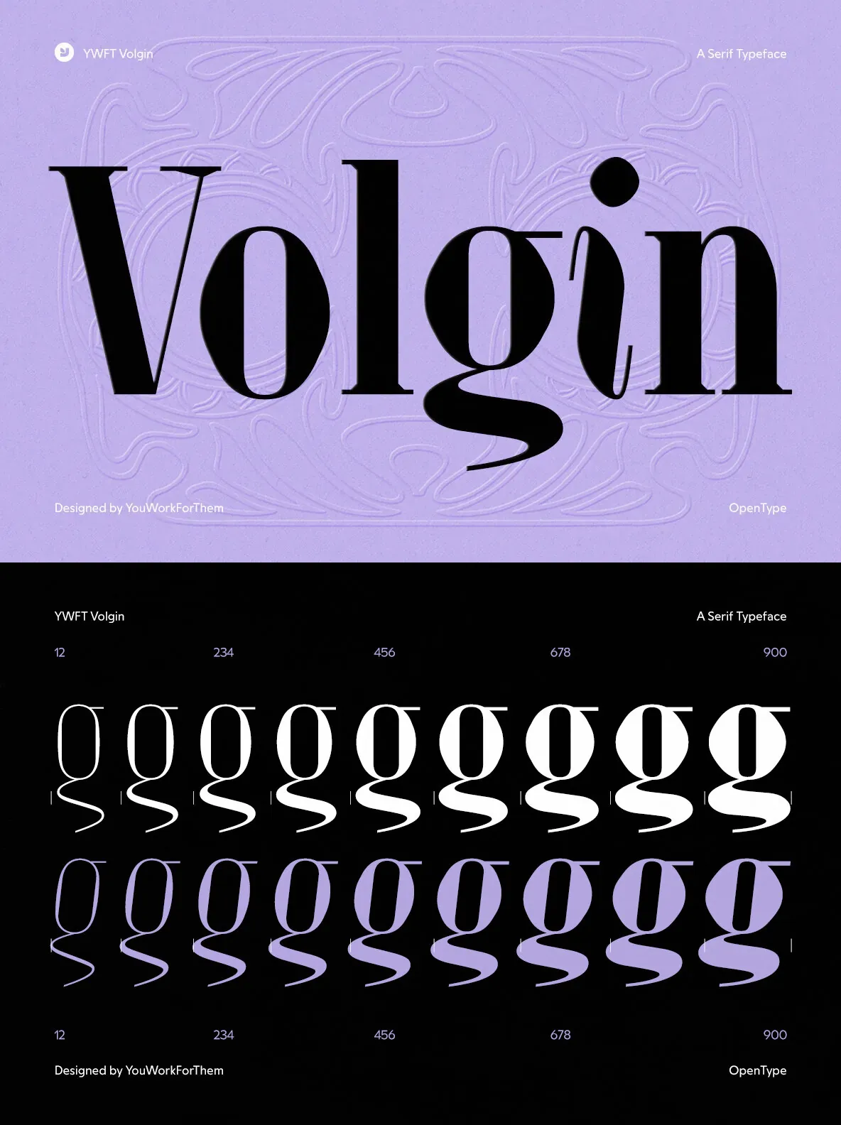
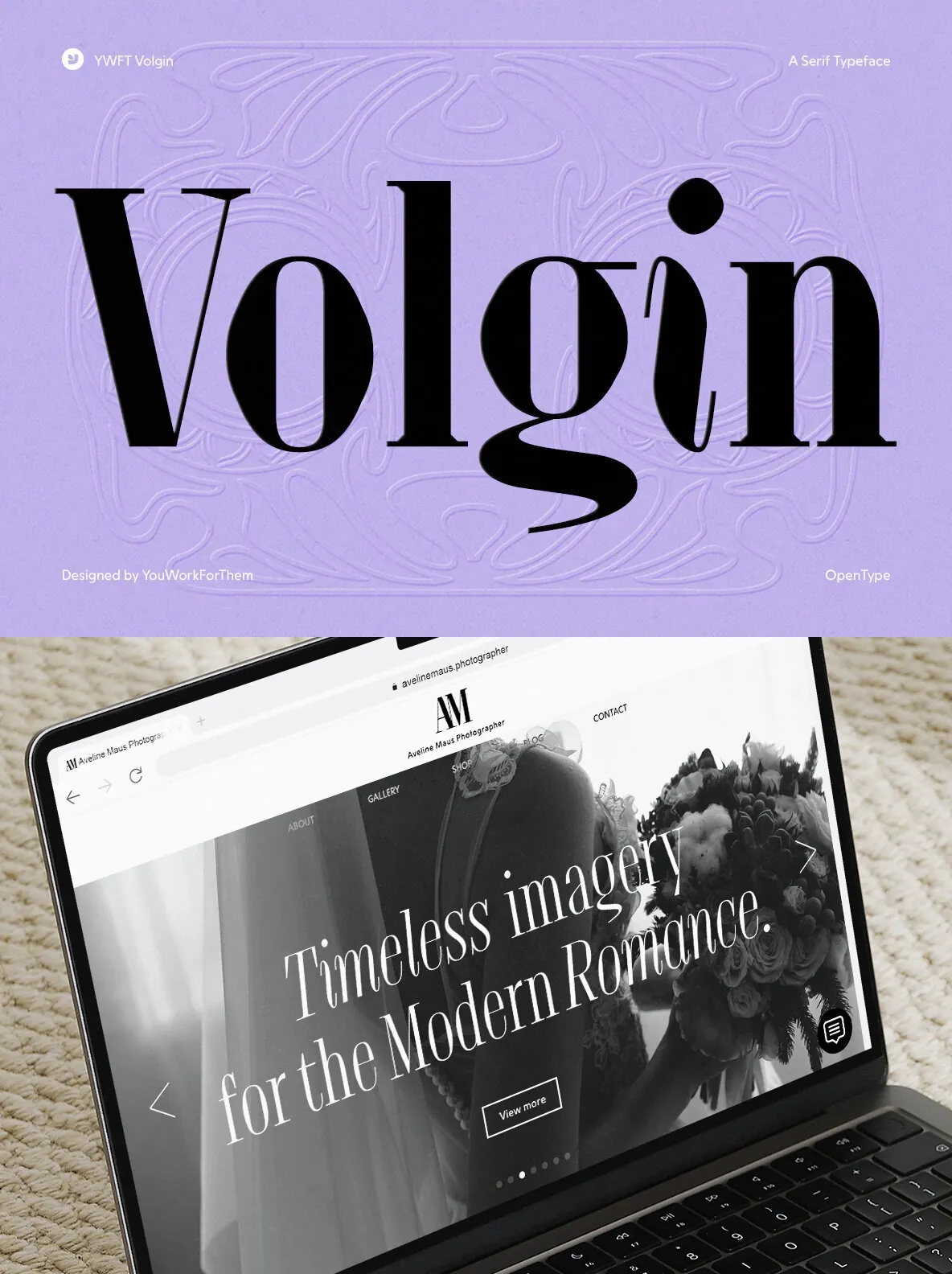
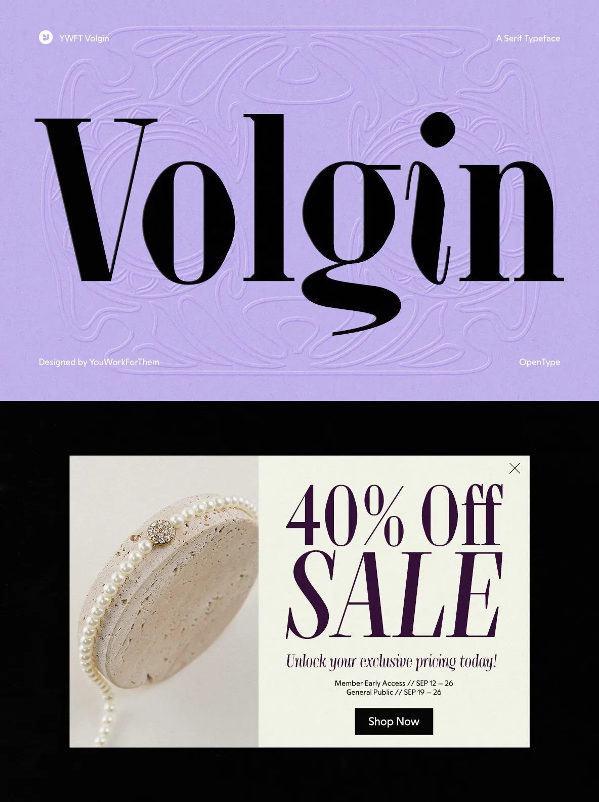
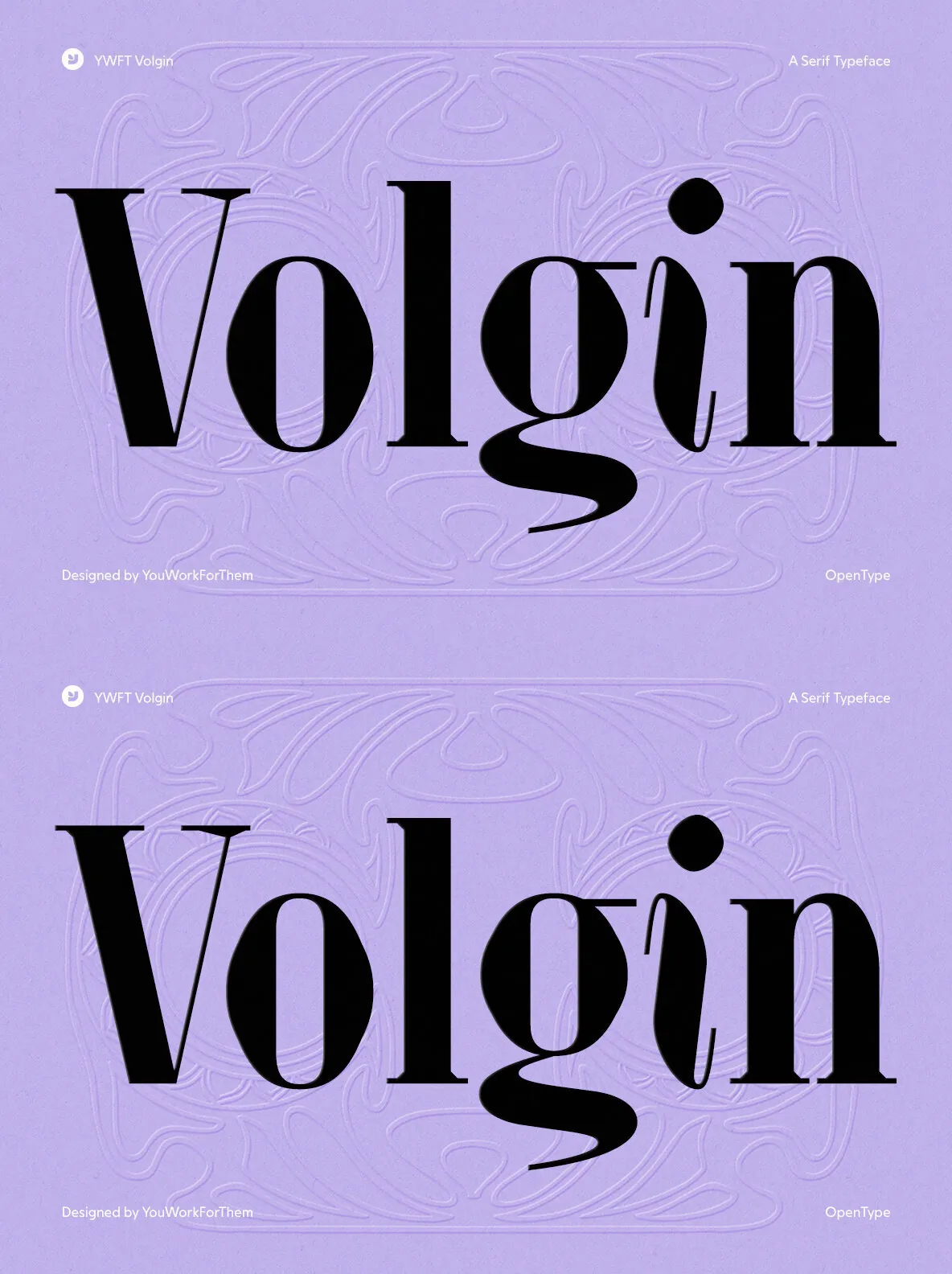
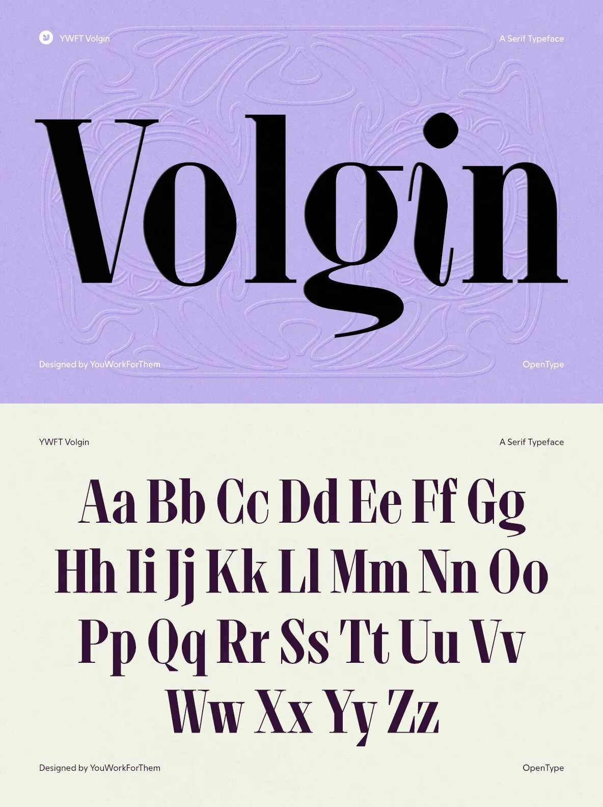
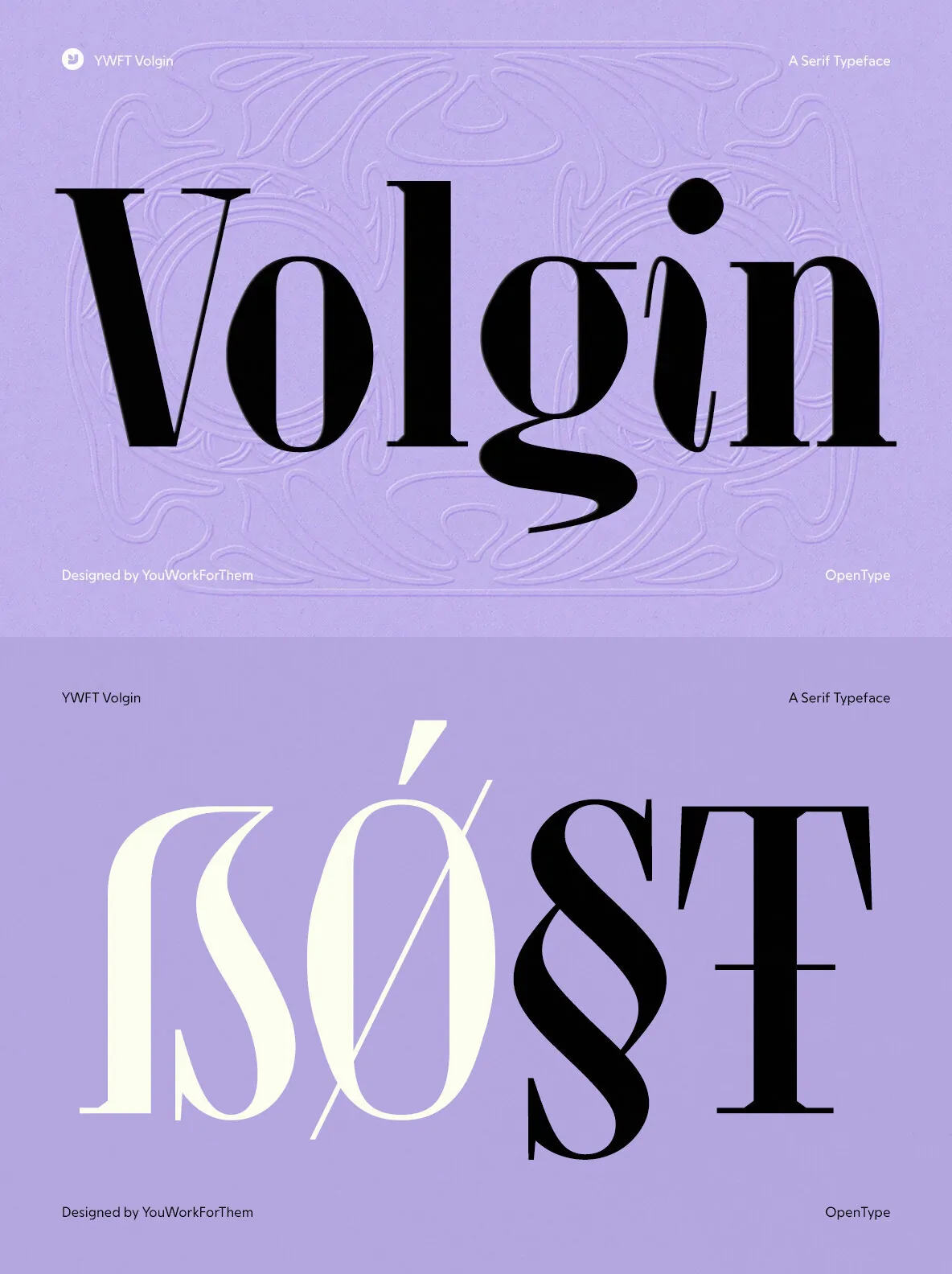
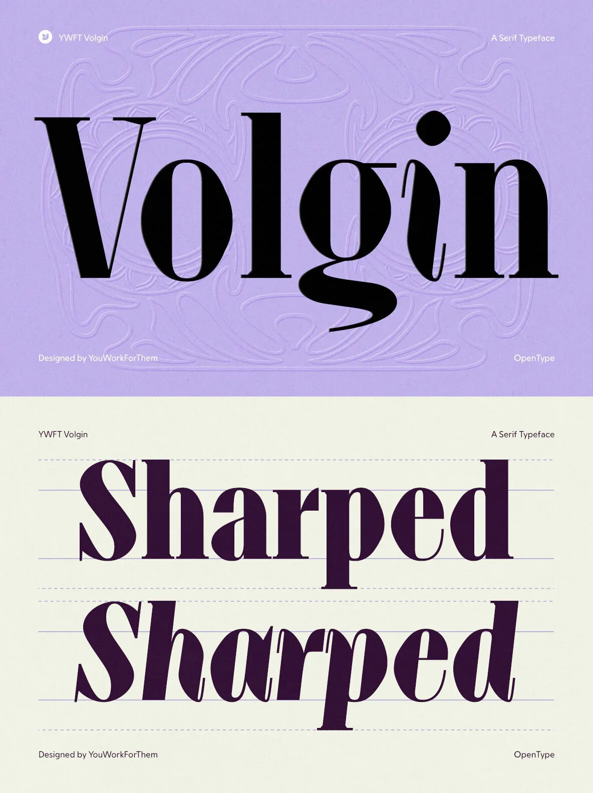
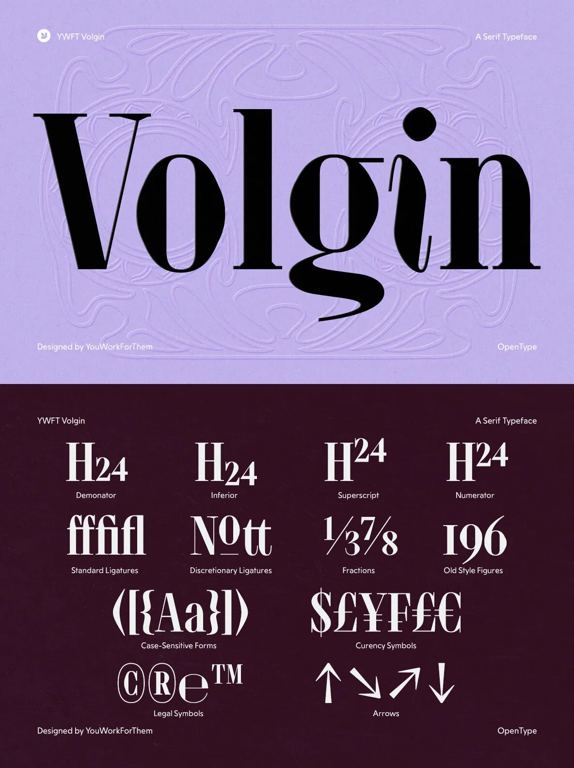
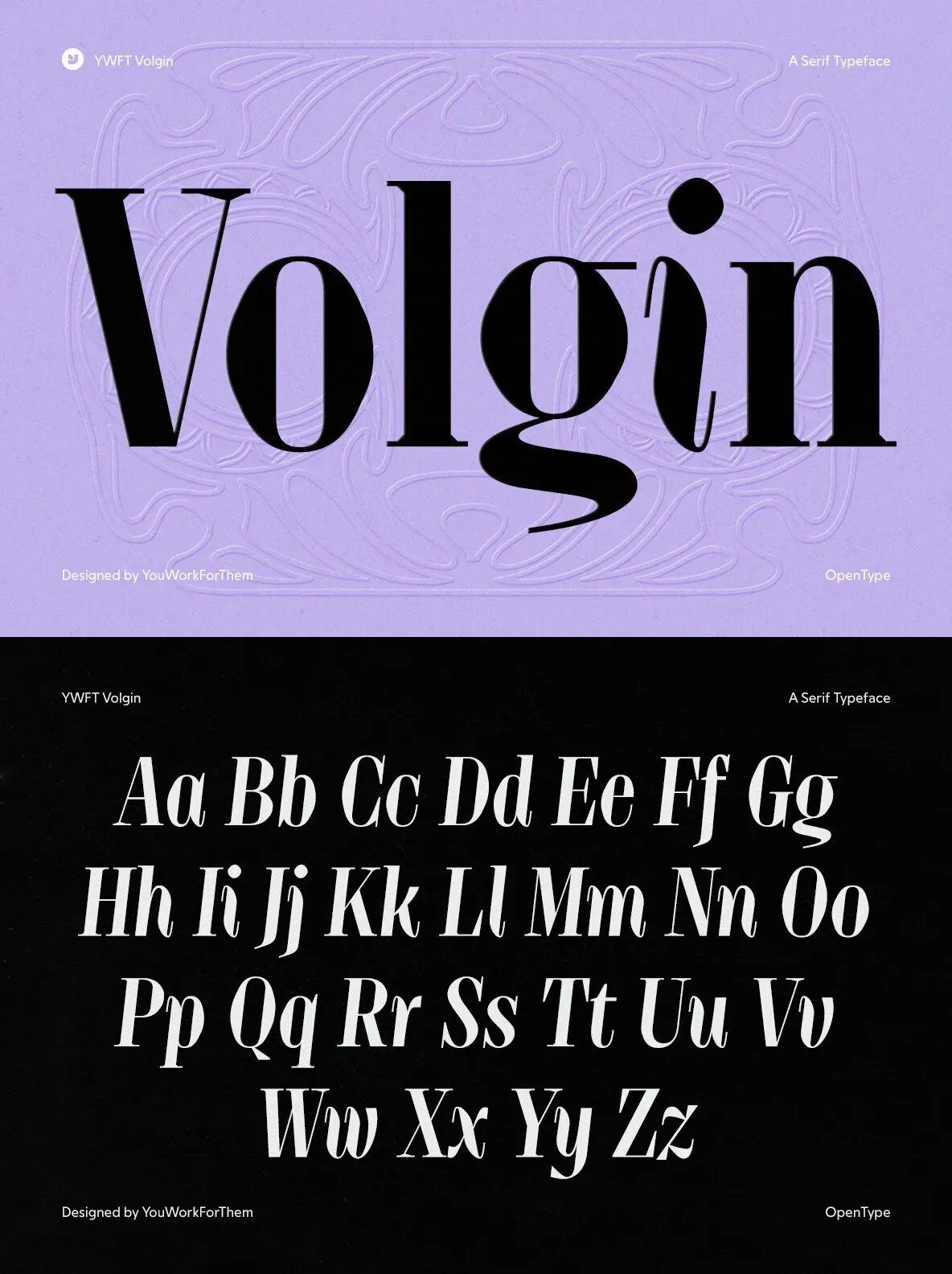
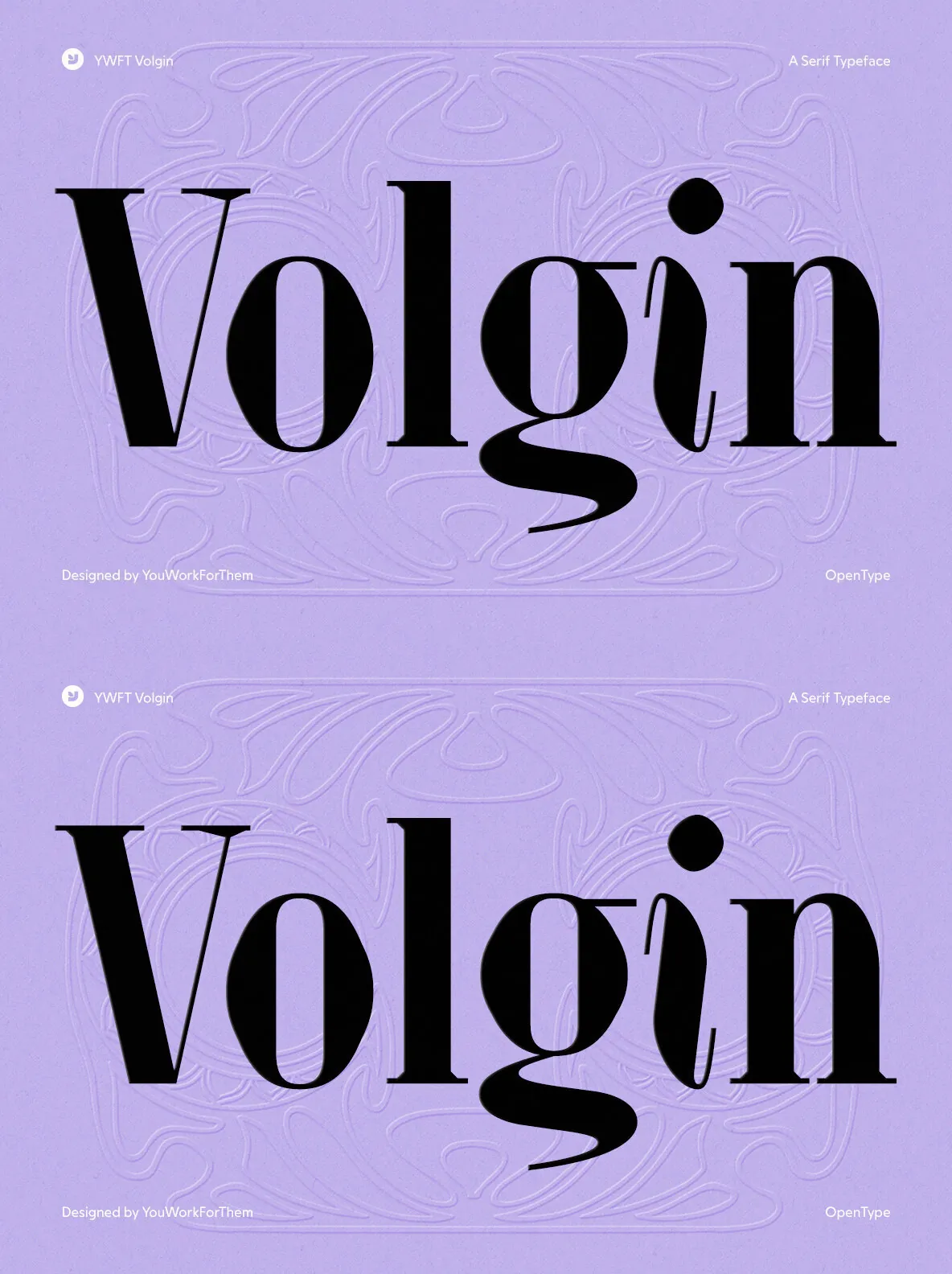
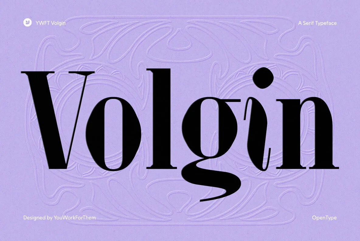
YWFT Volgin is a high-contrast Didone serif built on the tension between thick stems and razor-thin hairlines. Its vertical stress is deliberate, its proportions are tall and narrow, and its terminals are precise, with teardrop forms on the g and j and sharp bracketed serifs throughout. It reads as refined without trying too hard.
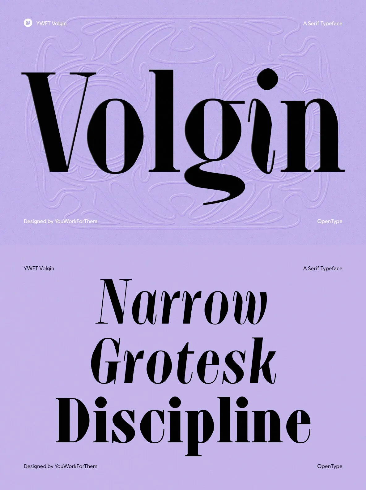
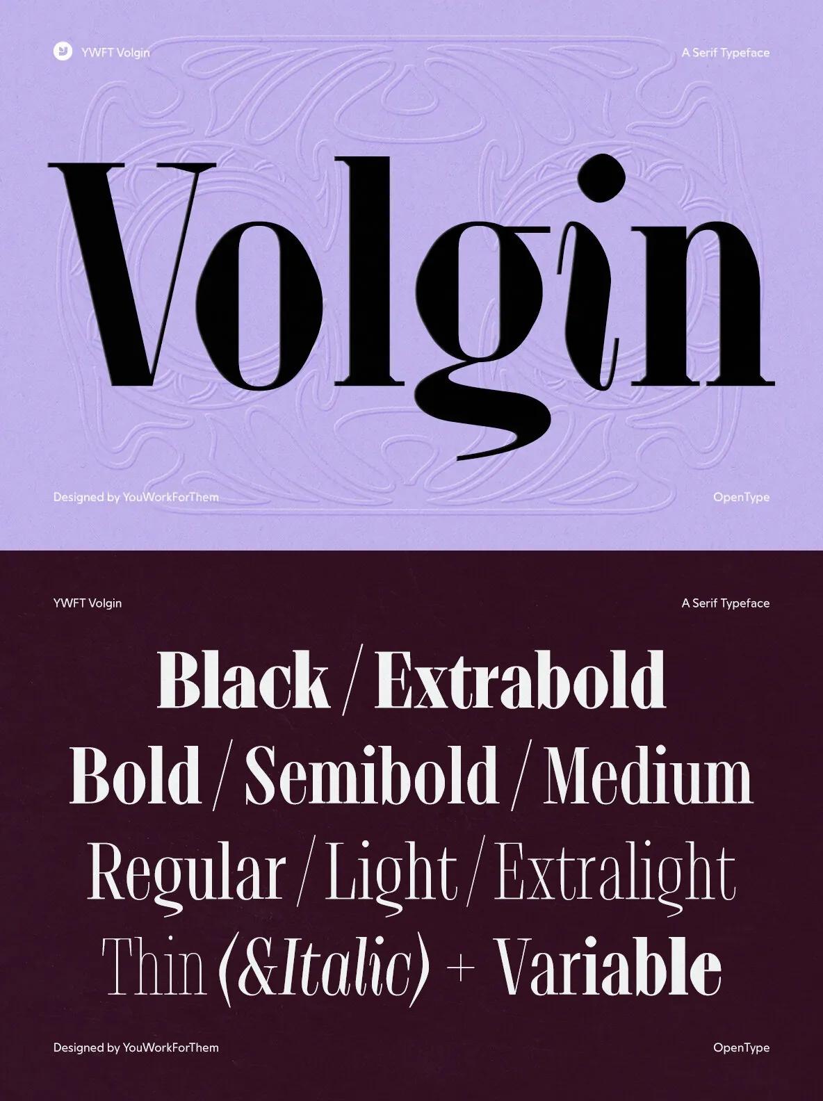
The family spans 9 weights with matching italics, including two variable styles, giving you real flexibility across a project. Light weights carry editorial grace, while heavier cuts land with authority. The italic feels expressive without breaking from the system’s discipline, making Volgin a reliable workhorse for headline hierarchies, not just a one-size display face.
Features:
YWFT Volgin includes 602 glyphs with extensive language coverage across Latin, Greek, Baltic, Central European, Vietnamese, and Pan African scripts.
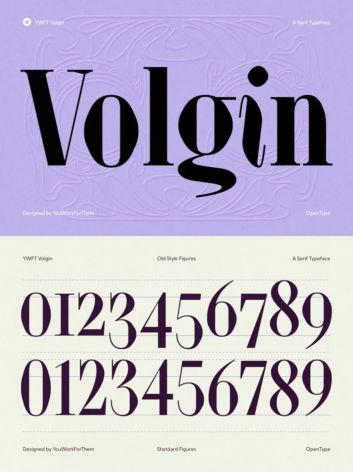
Its deep OpenType feature set includes oldstyle figures, discretionary ligatures, historical forms, scientific inferiors, fractions, and more, making it a practical choice beyond pure display use.
Two free demos are included
to test it in context before you commit.
An exclusive YouWorkForThem design, it is licensed at a fraction of what comparable Didone serifs cost elsewhere.
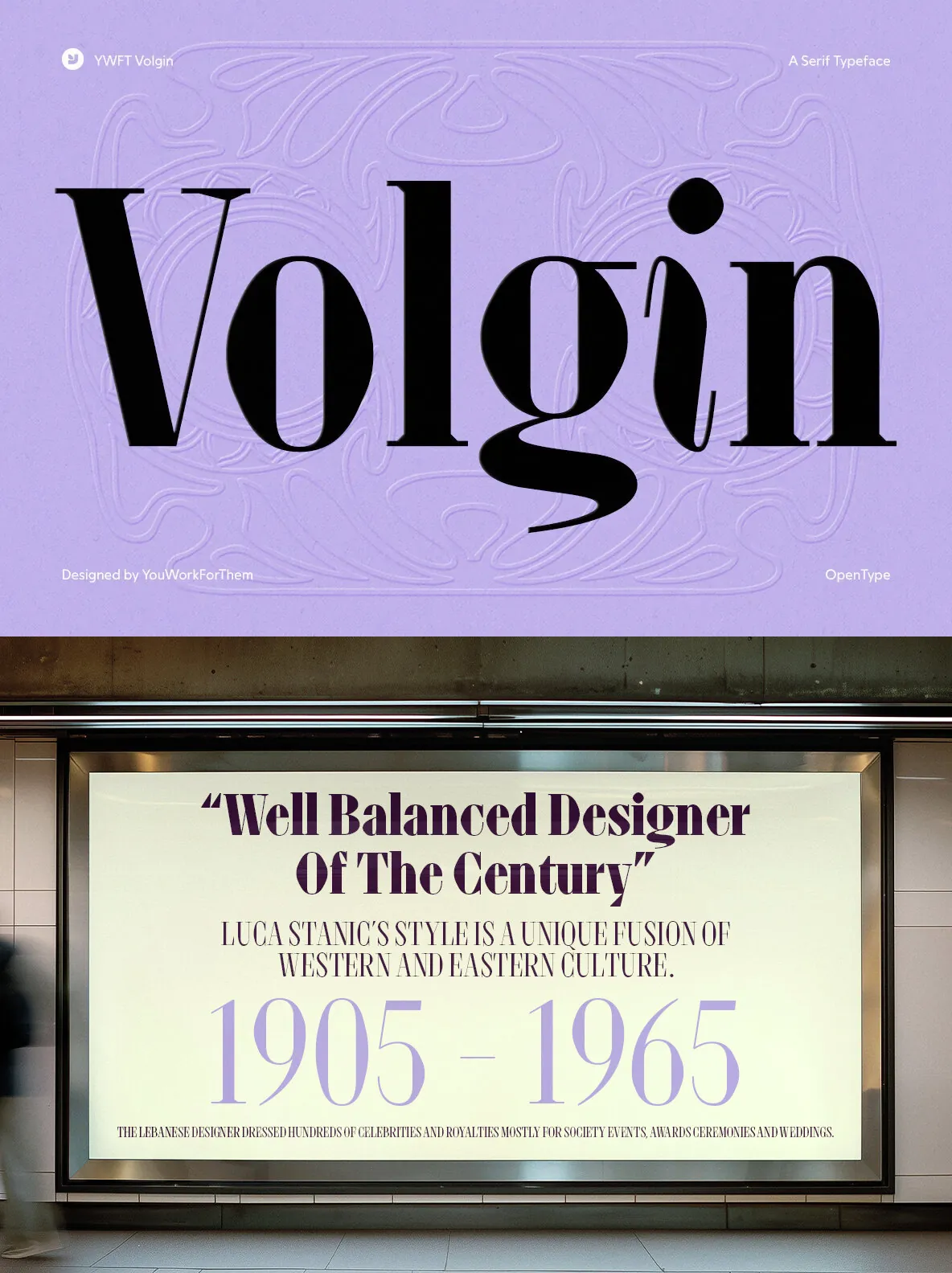
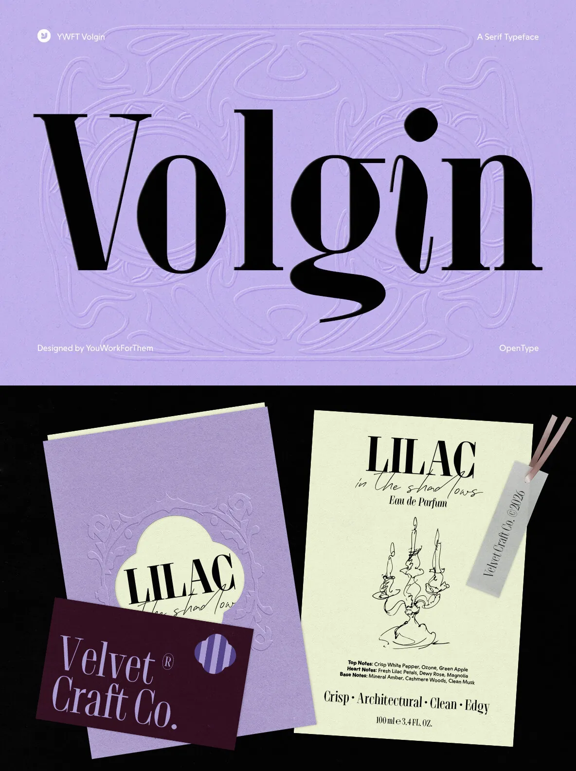
Use Volgin for magazine mastheads, luxury product packaging, editorial title treatments, fashion campaign type, and anywhere a serif needs to carry presence without weight.
Additional products used for slideshow images:
Aesthetic MacBook Mockups for Photoshop PSD
City screen 14 Graphics
Bride Posing In A Large Window
Pearl And Gold Jewelry On Travertine Stone, Minimalist Product