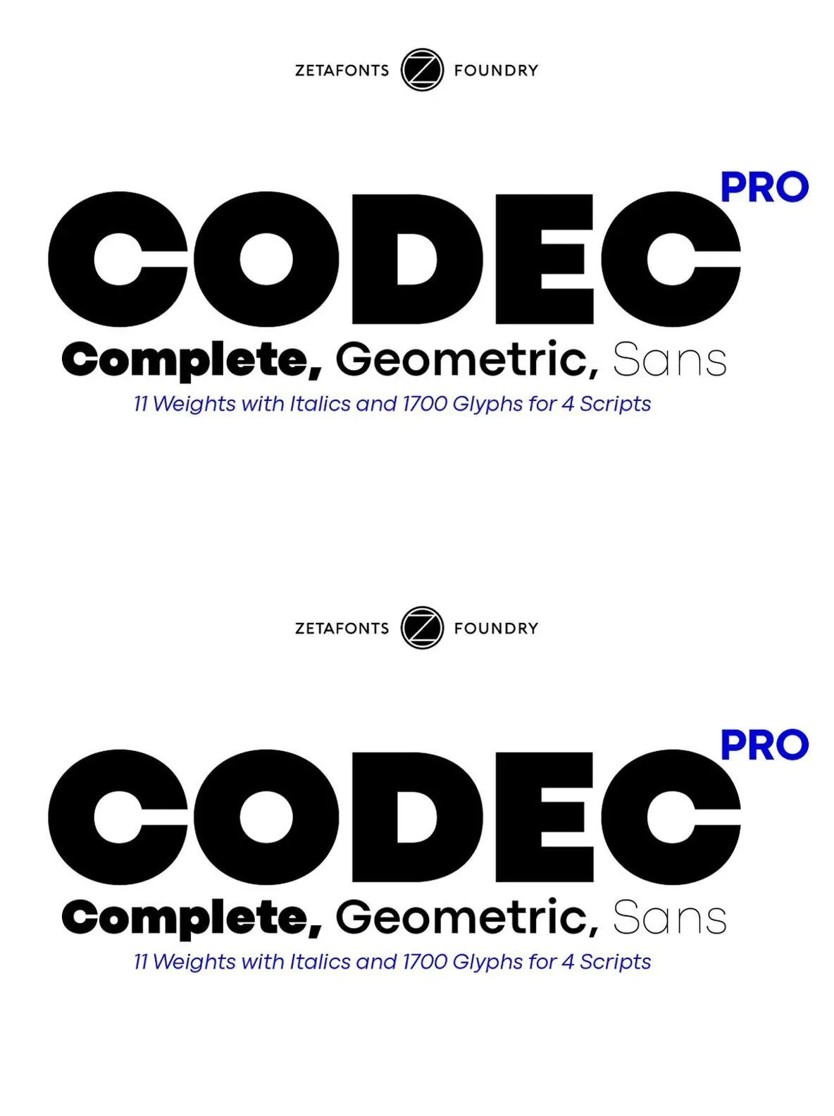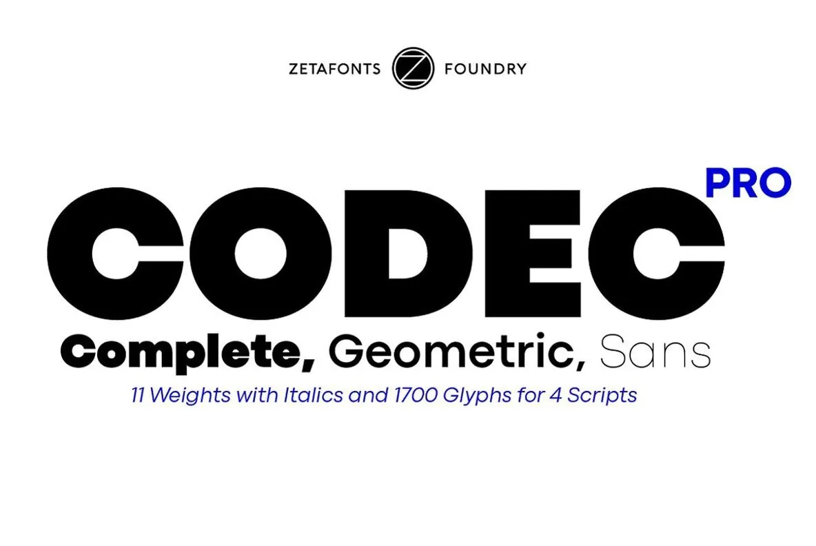

Codec Pro — Geometry, With a Human Side
The newest incarnation of the Codec family was developed in 2017 by Francesco Canovaro, Cosimo Lorenzo Pancini, and Andrea Tartarelli. It began as research into the subtleties and variations within geometric sans-serif design. The result reads clean and controlled, while still leaving room for personality across different tones and applications.
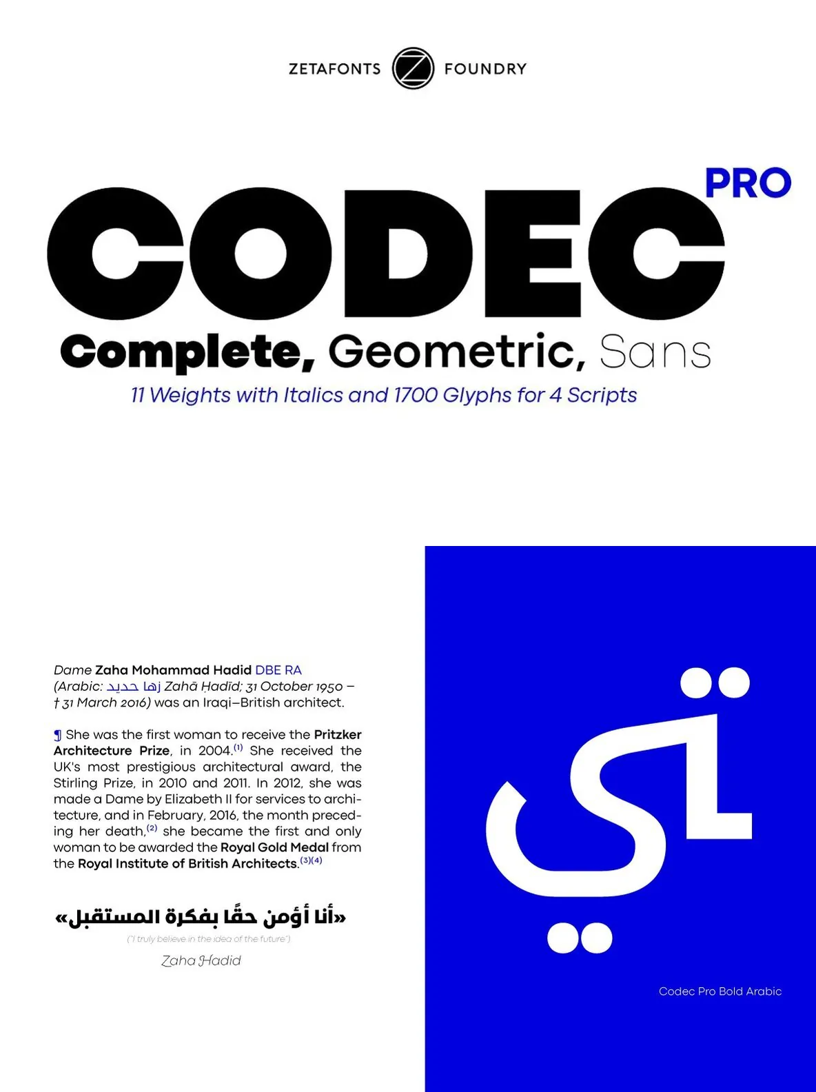
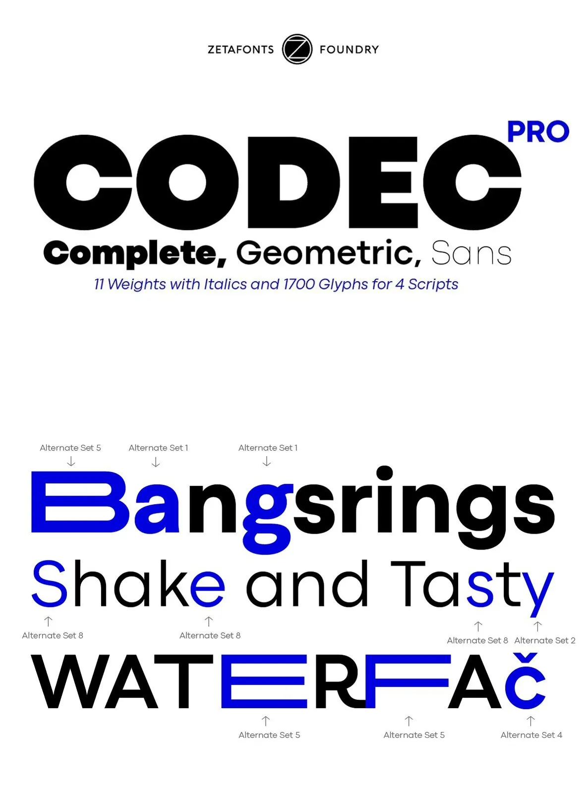
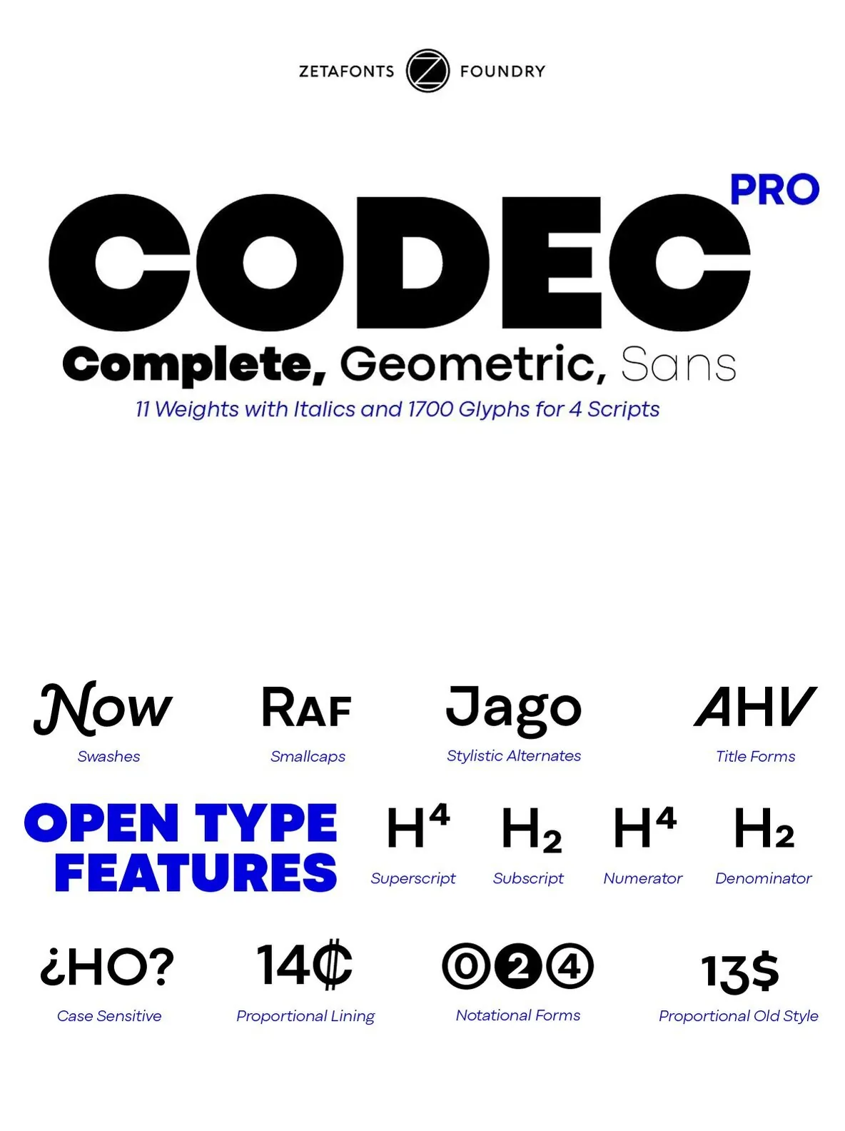
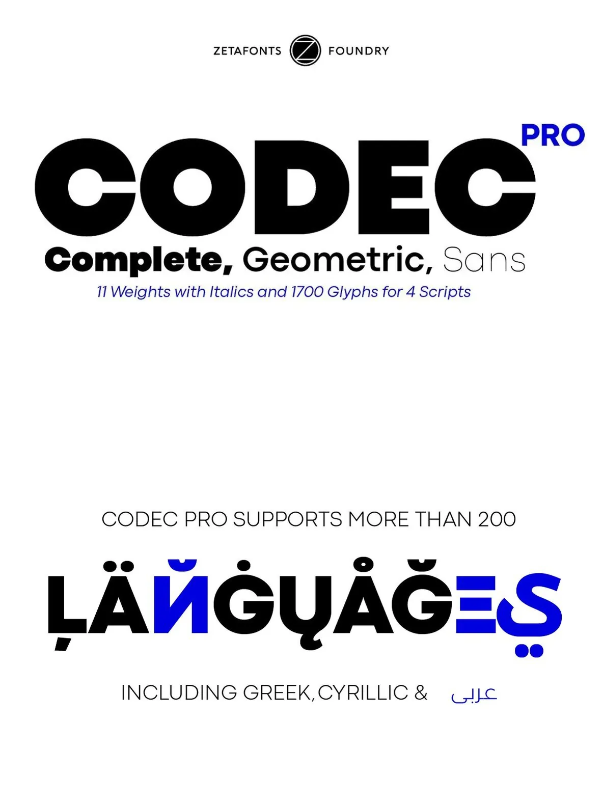
The original typeface has been completely redesigned and expanded to feature a wide range of eleven weights, from the hairline thin to the bulky fat. The character set has also been extended to include not only latin, cyrillic, and greek, but also arabic, farsi, and urdu scripts. Built as a veritable swiss-knife for designers, Codec Pro includes a wide range of alternates and stylistic sets that cover all subfamilies and moods of the original type system.
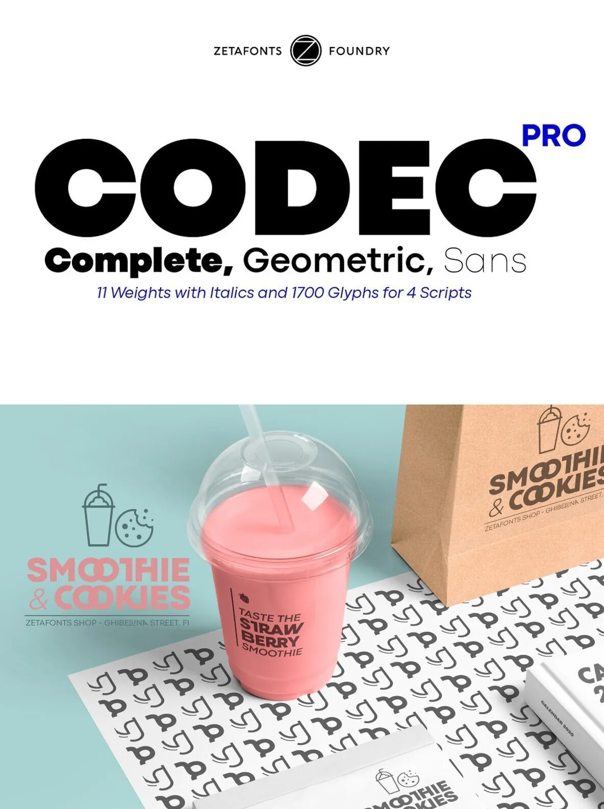
The standard set (Codec Cold) has terminals cut parallel or perpendicular to the baseline, emphasizing geometry for a more constructed look. Stylistic set 4 (Codec Warm) uses open diagonal cuts and humanist shapes for a gentler, warmer feeling. Set 3 (Codec Cold Logo) comes alive with funky ligatures, while Set 5 (Codec Warm Logo) stretches uppercase characters horizontally for a dynamic, unexpected effect.