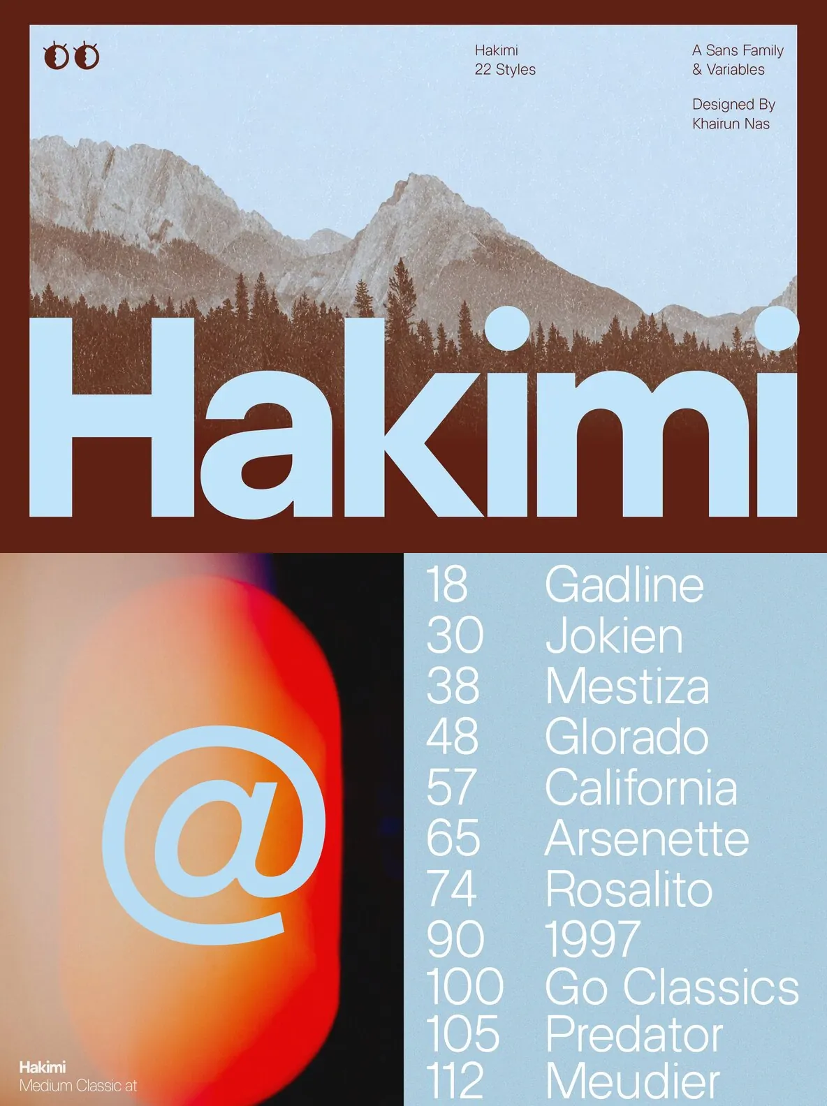
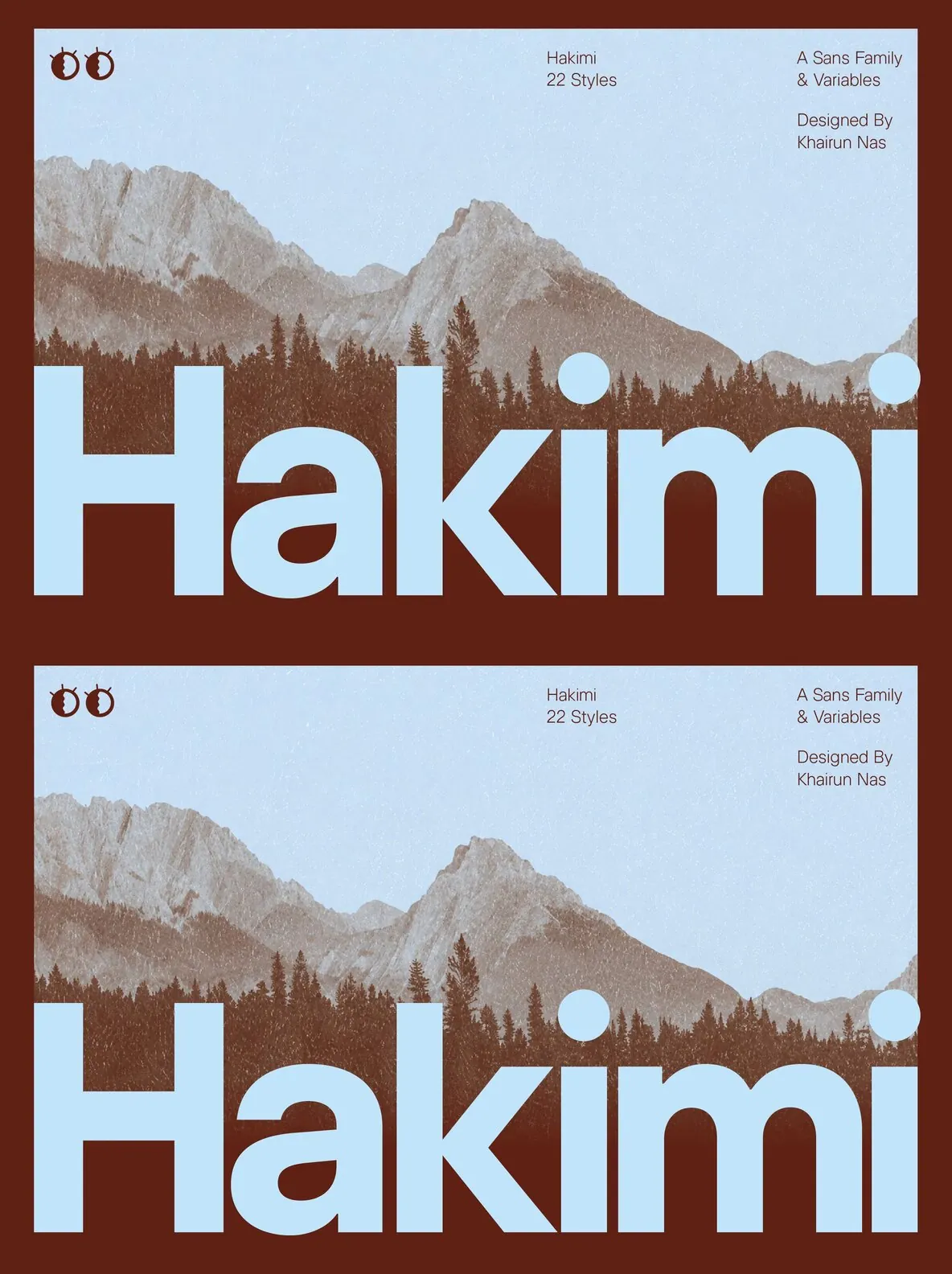
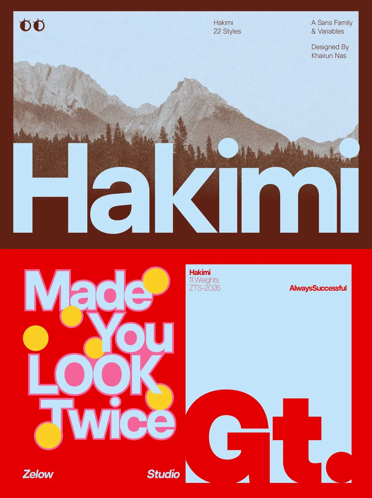
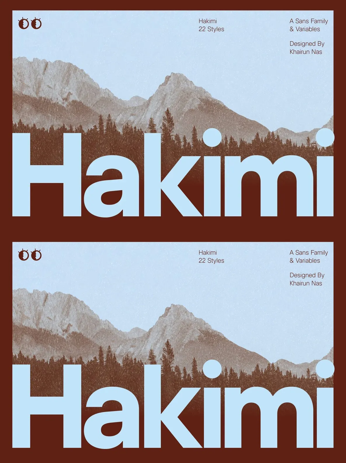
ZT Hakimi — Quiet Precision, Strong Presence
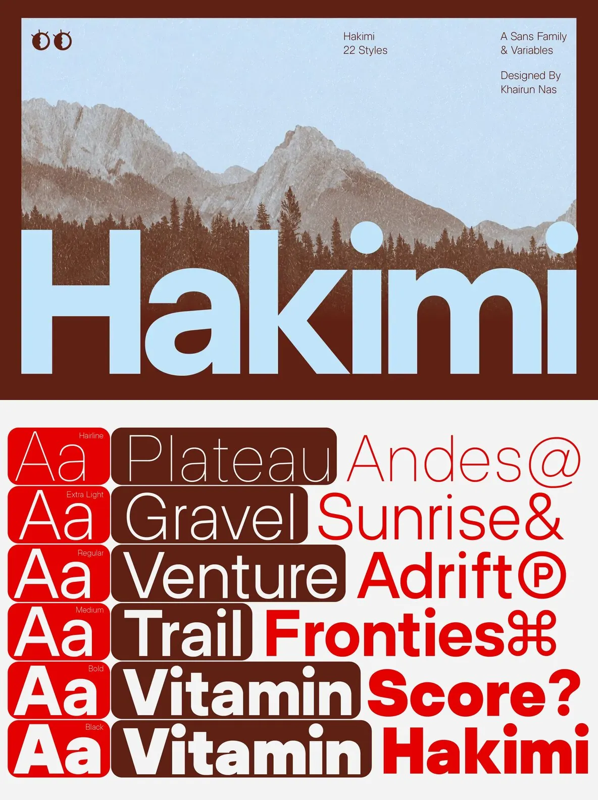
ZT Hakimi is a clean, balanced sans-serif built for straightforward, versatile communication. The family holds a neutral, well-proportioned structure from Hairline to ExtraBlack. Its letterforms stay consistent and readable across the full weight range, rather than shifting character as they become heavier or lighter.
Its discipline draws from two different worlds of typography. The clarity and restraint follow the same principles that guide modern interface typography: quiet, legible system type designed to sit cleanly on screen rather than compete with it. Its width and weight character take cues from contemporary display grotesques, with confident, expressive proportions built to hold presence at large sizes without losing composure. ZT Hakimi sits between those instincts: precise enough for interfaces and expressive enough for headlines.
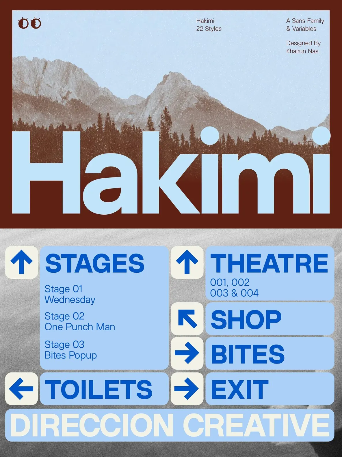
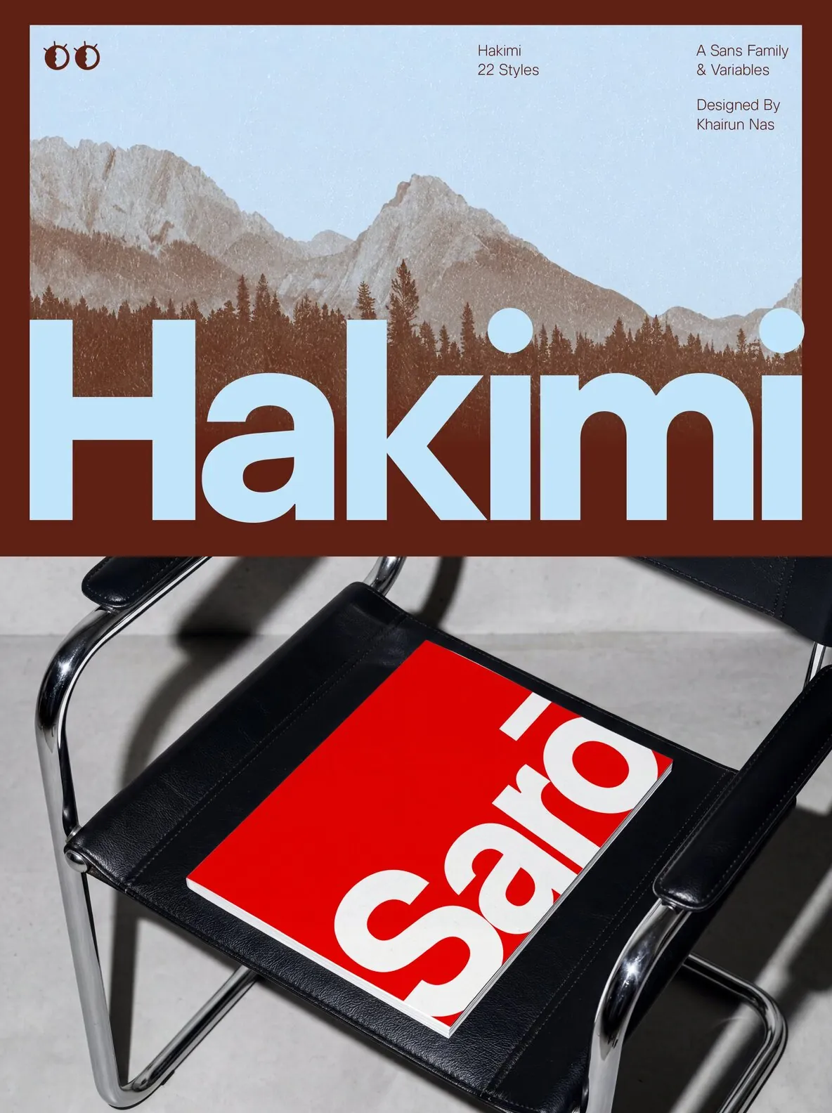
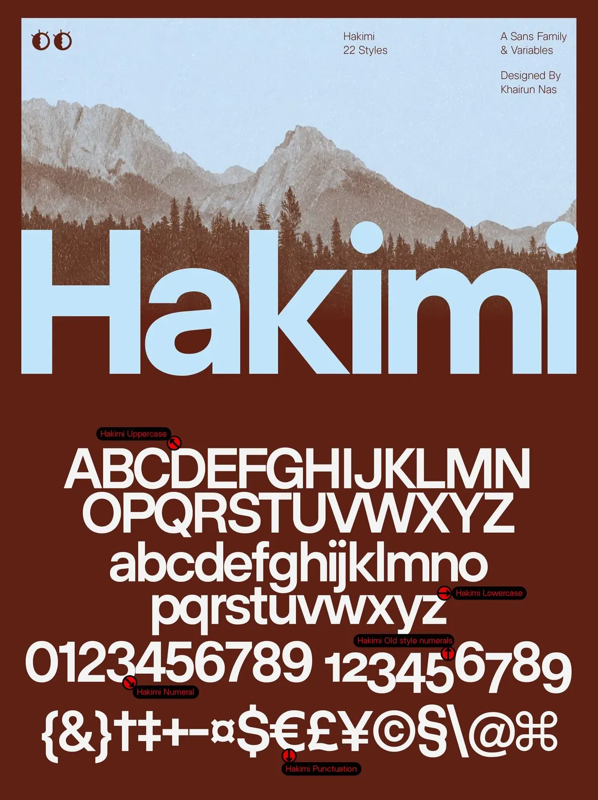
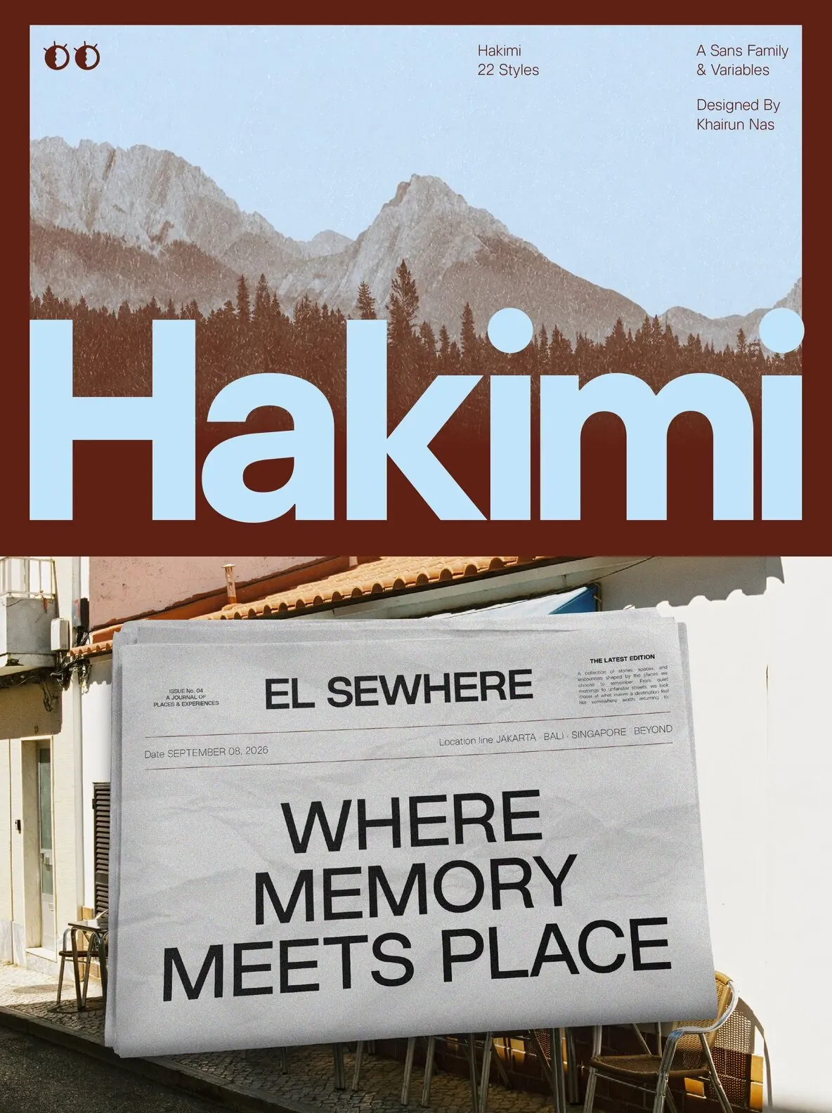
The family spans eleven weights in both upright and italic, for 22 styles total, alongside two variable font files covering the full weight range. Glyph coverage totals 600 characters across the Latin set, with support for old-style, tabular, and tabular old-style figures, case-sensitive forms, ordinals, slashed zero, fractions, subscript and superscript, and an extended currency set. ZT Hakimi works naturally across branding, editorial layouts, packaging, wayfinding, and interface design, staying legible and composed at both large and small sizes without drawing attention to itself.
Features of ZT Hakimi
22 Styles (11 Weights + 11 Italics)
2 Variable Font Files (Roman + Italic), full weight range
600 Glyphs
Latin character set
OSF, TF, and TOSF Figures
Case-Sensitive Forms, Ordinals, Slashed Zero, Fractions
Subscript & Superscript
Extended Currency Set